Texty, a visualization tool to aid selection of texts from search outputs
Jaume Nualart
Faculty of Arts and Design, Univerity of Canberra & Machine Learning Research Group, NICTA. Australia
Mario Pérez-Montoro
Department of Information Science, Faculty of Information Science. University of Barcelona, Spain
Introduction
Information retrieval is a critical factor in an environment characterised by excess of information (Baeza-Yates & Ribeiro-Neto 2011). When a user conducts a search, the information retrieval systems normally respond with a list of results. In many cases, the presentation of those results play an important role in satisfying user information needs. A bad or inadequate presentation can hinder the satisfaction of the information needs (Shneiderman 1992, Baeza-Yates 2011, Hearts 2009, Baeza-Yates et al. 2011).
Typically, information retrieval systems present the results of a query in flat, one dimension lists. Usually, these lists are opaque in terms of order, i.e., the users do not know why the list has a particular order. To refine their search, the users have to interact again, normally by filtering the first output of results.
The four main criteria used to organize a list of results are order, relevance, recommendation and clustering (Morville & Rosenfeld 2006, Pérez-Montoro 2010). The order organises the list of results by alphabetical or numerical order of some of the features (name of the author, date of creation) of the retrieved document. The relevance ranks the retrieved documents considering the relevance of the content of the document to the user's query. The recommendation can sort the results by using the number of recommendations suggested by other users who have previously used this result. The clustering presents the results grouped into a number of subsets formed by documents that deal with the same topic and/or addressing the topic with a similar approach (Larson 1991, Tryon 1939).
All these forms of organizing results, although used by most systems of information retrieval, have important limitations. The list of results organized by alphabetical or numerical order provides no extra information to help the users decide which of the listed documents can adequately meet their needs. When organising by relevance, the system places documents that could satisfy the information needs of the user at the top, but no extra information on the approach or on the internal structure of the document is provided. In the case of an organisation on the basis of recommendation, the top of the list provides documents recommended by other users and it does not provides extra information on the approach or the internal structure of the document. Finally, clustering provides extra information about the topic of the retrieved document, but it does not guide the user on the distribution and thematic structure of the document.
Visual presentation of search results
In recent years, apart from these more standard presentation of results and with the aim to overcome some of its limitations, a number of visual proposals have been developed to improve user interaction with search results. Most of these proposals can be articulated in three main groups: the clustering visualizations, the visualization of query terms and the visualzations using thumbnail images or miniaturized images of documents.
Visualization of clusterings intends to represent the categories and relations between those categories of the retrieved documents The main trends in these representations are based on the use of, among others, treemaps, tag clouds or network graphs.
The treemaps represent hierarchical relationships of a set of categories using nested rectangles and optimizing the space used for the visualization (Shneiderman 1992, Shneiderman 2009). Each rectangle’s size is proportional to the number of retrieved documents under that category. Normally the rectangles are coloured according to the category they belong to, for easy reading by users (see Figure 1).
The tag clouds represent the categories in a group of words, where the color and size of each word are proportional to the number of documents retrieved for each category (Begelman et al. 2006). The labels that appear in the cloud are usually hyperlinks that lead to the list of documents that have been retrieved under that label.
The network graphs represent each category as objects or nodes and their relationships using lines or curves. According to the most common interaction,if the user clicks on an object or category s/he will get the list of retrieved documents classified under a category. There are many examples applying this type of visualization, see: Moya-Anegón et al. (2004), Granitzer et al. (2004), and Brandes et al. (2006).
The visualization of query terms given by the user tend to follow two strategies: visualization of the terms within the document or in a page of results (Hearst 2009). In the first case, the system outputs the document highlighting those words that literally match the terms of the query (Egan, et al. 1989). Some studies indicate that users prefer to see this technique implemented by using colour in highlighted words that match the query terms (Hornbæk and Frøkjær 2001). In the second case, each document is represented on the results page as a horizontal bar proportional to extension of the document and small squares are added for eaxh query terms that appear in the text (Hoeber and Yang 2006>). As in the previous case, some studies indicate that this representation improves with the introduction of a colour scale proportional to the frequency of the query terms in the document (Anderson et al. 2002).
Another technique for visualising query terms in a results page is to add thumbnail images or miniaturized images of the retrieved documents on the page. This technique is based on the fact that the human visual system captures the essentials of an image in 110 milliseconds or even less, just what it takes to read a word or two (Woodruff et al. 2001). Some studies claim that adding these images in the search results allows the search to function as visual summaries of documents (Jhaveri and Räihä 2005).
All these new proposals can improve the search experience of users, but they all have important limitations.
Compared to visualizations of clustering, the treemaps provide extra information on the thematic focus of the retrieved documents and the semantic relationships among them. However, the treemaps do not provide information on the distribution and thematic structure of each document. Tag clouds also provide extra information on the thematic focus of the retrieved document but, they do not provide information on possible semantic relationships between documents, nor orientation on the distribution and thematic structure of each of these documents. Finally, the network graphs provide extra information on the thematic focus of the retrieved documents and possible semantic relationships between documents, but do not provide the distribution and thematic structure of each document. Network graph are also difficult to explore in a comfortable way when they include many nodes and edges. Then the use of a zoom to get a global and the partial views of the network is needed (Viégas and Donath, 2004). Some authors advocate for combined strategies centring the graph on the node that interests the user (Yee et al. 2001) or eliminating those nodes that are not selected by the user (Fellbaum 2010).
Visualizations based on the query terms also have important limitations. On the one hand, they only provide documents in which the query terms appear. They do not provide extra information on the thematic focus of the retrieved documents, nor possible semantic relationships between retrieved documents.They do not give any orientation on the distribution and structure of those terms unrelated to each of these retrieved document either.
Finally, the visualization strategy which involves completing the list with thumbnail images or miniaturized images of retrieved documents also has important limitations. These visualizations, though complementary, do not provide extra information on the thematic focus of the content of the retrieved documents or on semantic relationships between retrieved documents. They do not show to the user the distribution and thematic structure of each document either. Along these lines, studies show that the thumbnails images strategy does not significantly improve the search experience of users (Czerwinski et al. 1999, Dziadosz and Chandrasekar 2002), although they can be helpful in part if the images are enlarged (Kaasten et al. 2002)
These limitations lead us to seek new forms of visualization that can help to improve the search experience of users in information retrieval systems and any other case where the user has to choose or select documents from one dimenssion lists of documents.
The proposed tool presented in this paper aims to face these limitations when deployed as a complement to traditional one dimension list of documents or to a list of results of information retrieval systems, such as clustering or sorting by relevance. This tool shows the essential parts of the contents of each item on the retrieved list and it helps the users in identifying the structure of the content of text documents, without having to tackle each one of the results intellectually.
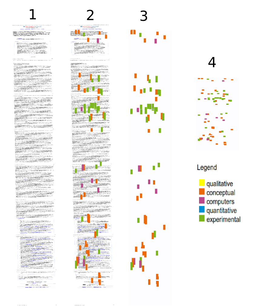
We used graphic techniques that were very similar for those used forauthorship recognition by Keim and Oelke (2007) and for those used by Hearst (1995) in TileBars . Keim’s technique represents the length of the phrases in each text as little squares with colour grading. In this paper this technique is applied very differently. TileBars also show the distribution of terms along the text as Texty does, but the terms come from a search query and the colour intensity is prportional to the frequency of the queried term in each document. In Texty, colour dots show the density of concepts referring to a particular linguistic field, which we call in this paper vocabulary. In Texty, the human eye analyses visualizations as it would do in Keim and Hearst. Visual coincident factors are colour zones, density of dots and the position and distribution of dots on the plane.
A third tool that graphically is similar to our work is Table Lens (Rao and Card 1994). In our case, we are not representing table structured data (columns, rows, data in each cell), like Table Lens does. Also Texty is not interactive as Table Lens is. Texty is simpler tool and it does not allow accurate data browsing neither.
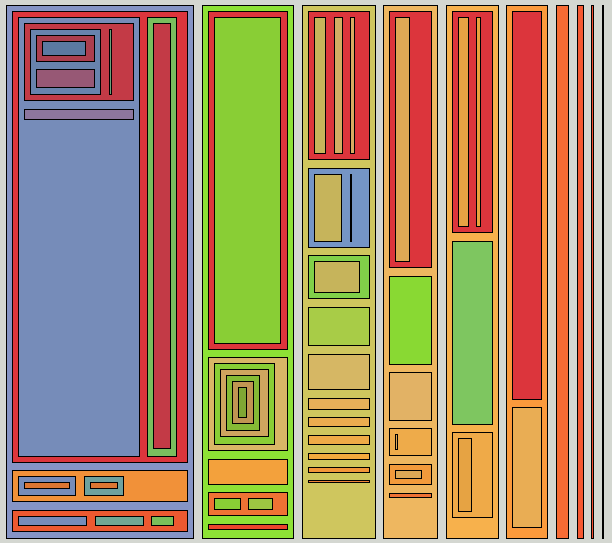
Technically, a Texty is an image, an icon that represents the physical distribution of keywords of a text as a flat image. These keywords are grouped in vocabularies, to each of which a colour is linked (see Figure 4). Texty reveals, the structure, conceptual density and subject matter of a text. Texty is a non-intrusive technique, in that an eventual implementation it does not necessarily interfere with the original information system that stores the documents. In this paper we show that this text representation tool enriches the one-dimensional lists that result from searches or from any other static list of documents.
It is important to note that the human brain is capable of detecting variations of dots’ density (Burguess and Barlow 1983) independently of the used colours (Nelson and Halberg 1979). Each array of dots of colour may represent a concrete linguistic field or vocabulary. The human vision can differentiate between colours quite well, especially when green and red are not present at once (Few 2008).
Method
In 2008 and 2009 at the Ludwig Boltzman Institute, Linz, Austria, the challenge was laid down to make visualization tools with the data from the archive of Ars Electronica, a file of digital culture, media art and technology that had been collecting data since 1987. A lack of representation of collections of texts with the same linguistic register was identified. The research was to find the way of representing a text before reading it: a way to distinguish texts on a list and be able to compare them. Initially, as well as texts, there were five high-quality vocabularies on the history of media art: art work, person or institution, date, keyword and award. These were worked out by G. Dirmoser (Offenhuber and Dirmoser 2009) who provided the basis for developing a tool that showed these five vocabularies by five different colours in a proportional, representative image of the actual text. This work gave the first intuitive representations with the Texty technique.
In this paper we present a more elaborate study of this technique, analysing its featuresin comparison with classic techniques of representation. The aim of the study was to develop and improve this technique as a complement to information search and retrieval systems.
The stages of the research were: data selection, choice of semantic categories, selecting and identifying the sources for the vocabulary corpus, the processing of terms for each vocabulary, the design of the corpus of texts for representation and the creation of Textys, for each text of the collection.
Data selection
For the study we looked for a controlled collection of texts with a similar register and a specific semantic field. In addition, to assist the study, the texts had to be freely accessible.
For all these reasons we chose the papers published in Information Research. These papers belong to the same document collection, have unity, share the academic register, have a similar structure (introduction, method, analysis, results) and have standardized quality (peer-reviewed).
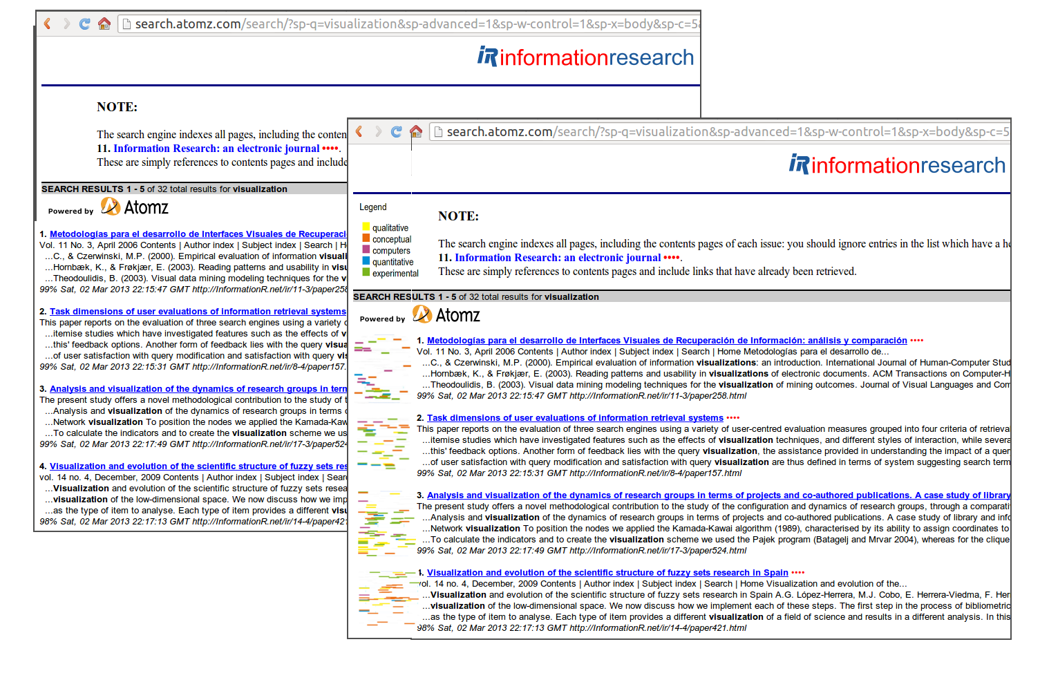
The Information Research Website has a search system, by theme, by number or by author. It has a separate list of reviews, along with two retrieval systems: Atomzsite search and Google. The aim of this paper is to present Texty, a tool for information retrieval representation that goes further than the above resources for locating information.
Choice of semantic categories
Once the corpus of texts had been chosen, we identified the following subject categories that could help to classify their contents: conceptual approach, experimental approach, qualitative methodology, quantitative methodology and computers and information technology.
We could have chosen other alternative categories, however, from our personal perspective, as researchers working mainly in IT related issues, the five categories we have chosen are the main criteria for selecting the literature we use to perform the state of the art of the discipline: approach, methodology and degree of technology employed.
The election of the semantic categories, though related to the corpus of texts, is not unique and could be different without affecting the presentation of Texty as a possible helpful tool.
Sources for the corpora of the vocabularies
The next step was to identify the sources of information from which the vocabularies that would be developed subsequently could be extracted. The choice of these sources was based on two complementary criteria. One was the intellectual prestige of the source. This criterion led us to select the Stanford Encyclopedia of Philosophy and the Encyclopaedia Britannica. A second criterion was the popularity of the source, which led us to choose Wikipedia. The distribution of sources by subject matter is given in Table 1.
| Definitions | |||||
|---|---|---|---|---|---|
| Qualitative Methodology | Conceptual Approach | Computers & information technology | Quantitative Methodology | Experimental Approach | |
| Stanford Encyclopedia of philosophy |
Aristotle's categories Intrinsic vs. extrinsic Properties |
Concepts Category Theory |
Mathematics Statistics |
Experiment in physics | |
| Britanica | Qualitative states qualitative tests to distinguish alternative theories |
Mathematics statistics |
|||
| Wikipedia | Qualitative data Quantitative property Qualitative properties Qualitative research Quality (philosophy) |
Terminology Theory Vocabulary Concept |
List of programing languages List of popular computers List of hardware componets, software glossary |
Test method Case study Experiment |
|
Importantly, although this has not been implemented in this study, it would be interesting to create, for each of the five vocabularies, a thesaurus (controlled vocabulary) which would spell out the different types of terms (preferred terms, variant terms, broader terms, narrow terms and related terms) and semantic dependencies (equivalence, hierarchy and association) between terms. This solution would solve the problems of silence and noise in indexingderivatives of synonymy and polysemy of terms.
Processing of the terms for each vocabulary
Then the five vocabularies, based on the five corpora of texts for the concepts chosen, were defined (see Table 1). First, a stopword filter was used, to take out the empty words. Then the words occurring fewer than four times were deleted, as they were considered of little significance for each subject. Then the words occurring in more than one vocabulary were deleted, i.e., we removed interference between vocabularies. Thus we obtained a number of terms for each vocabulary (Table 2).
| Vocabulary | Number of terms | Terms /1,000 words |
|---|---|---|
| Conceptual approach | 610 | 21.16 |
| Experimental approach | 510 | 23.29 |
| Qualitative methodology | 451 | 19.71 |
| Quantitative methodology | 700 | 22.24 |
| Computers & information technology | 312 | 18.91 |
Finally, there was an intellectual review to detect terms that were inconsistent with the subject matter, ambiguous terms and terms that were not coherent with each vocabulary. The experimental vocabularies were configured as in Table 3.
It should be said that the objective of this paper was to introduce the potential of the Texty tool. It is not a goal of this paper to study the best strategies to define the words that best represent a concrete field of knowledge or, as we call it in this paper, a vocabulary. In machine learning there are very powerfull methods like building topic models. This is an interesting possibility for future research.
| Vocabulary | Number of terms |
|---|---|
| Conceptual approach | 65 |
| Experimental approach | 53 |
| Qualitative methodology | 74 |
| Quantitative methodology | 86 |
| Computers & information technology | 410 |
The computers and information technology vocabulary is descriptive, which is why we left a large number of terms, as they all clearly refer to computers and information technology. The final list of words in all the vocabularies can be found here.
Regarding the possible overlapping of colour dots we recommend to set a number of terms per vocabulary that avoids an excess of terms per line of the text.
Corpora of texts to represent
After choosing the papers from Information Research as corpora of texts to which the Texty tool can be applied, then a private replica of the journal Information Research was made to conduct the study in laboratory comfort and also to show clearly how Texty can be implemented in an existing system. Information Research is made out of static HTML pages and Texty has been introduced in each issue's index and in subject index (link in red on the left column). Texty representations of papers in Information Research papers are to be found here. [To access, use the user name 'texty' and the password 'texty'].
Creation of the Textys
There are a lot of ways to, technically, create Textys. The choice it will depend on the required level of production and concrete conditions of each case. Here we describe the simple automated method that has been used to create the almost 500 Textys required for this study.
The initial format of the texts taken from the Information Research website was HTML. The HTML files were parsed and an specific class for each vocabulary was applied to all vocabulary's words found. Then a specific colour's style was defined using a Cascade Style Sheet (CSS), to the vocabulary's words; the rest of text was defined as white. Finally, a screenshot of the HTML page was taken and the size was adjusted to 300x450px for each Texty.
In this study we created Textys with five different colours, as shown in Figure 5. When choosing the colours, the main restrictions usually recommended for this kind of graphic attribute were taken into account. One restriction was the use of basic colours that most of humans can distinguish (Kay and Maffi 2008). A second restriction was that humans have very litle difficulty identifying three to five colours; and for seven to nine colours the identification becomes significantly more dificult (Healey 1996).
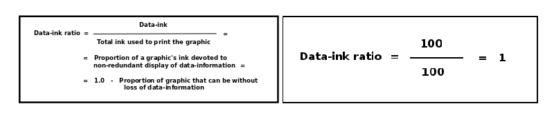
At this point we should stop a moment to analyse the information contained in the white areas of a Texty. Since the Texty is a physical representation of data, i.e., the colour dots appear in positions that reflect the real positions of termsin the text, the absence of ink gives relevant information about the text represented. Bearing in mind the theory of Tufte on the ratio of ink and data (Tufte 1986: 93), for Texty we would have to say that they are data without ink. The absence of colours means a lower density of terms of the proposed vocabularies along the text. If we view the white zones as zones with data, Tufte’s formula in the case of Texty would be as follows (see Figure 6), with the maximum proportion of ink devoted to representing data:
Results
We created Textys for all the papers in the Information Research, from Volume 1, No. 1 (1995/96) to Volume 15 No.4 (2010), with a total of 454 Textys. Below, Figure 7 gives the Textys of the 17 papers in volume 15, no. 4 (December 2010) of the journal.
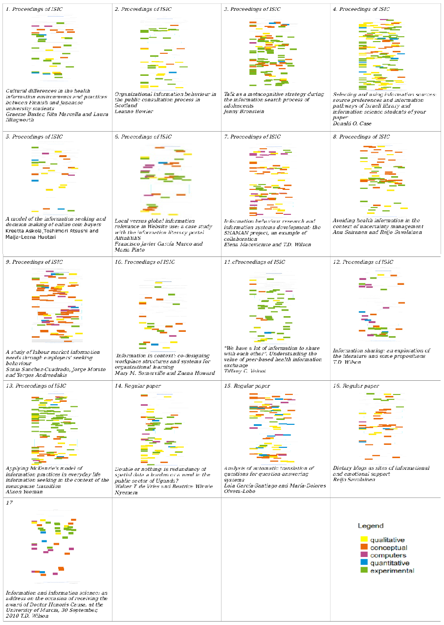
We presented Texty as a simple and complementary tool to enrich lists of texts. In this respect, a first glance at Figure 7 can help the reader to select papers to read as follows:
- The predominant tone in this issue is experimental (green), though followed closely by the qualitative approach (yellow).
- Papers 3, 11 and 13 look clearly experimental (green), while paper 7 looks like one that requires the reader to have more knowledge of computers and information technology (violet).
- Five of the seventeen papers (38.5%) have a notable presence of omputers and information technology (violet).
- The paper with the biggest conceptual load is the 9th, though the 7th, 8th and 16th also have a conceptual content (orange).
- The more generalist paper seems to be the 15th.
- This issue does not involve quantitative methodologies much (blue).
Here we can see how Texty can be used for the exploration and navigation of texts before they are read.
Starting from this development we want to see what would happen if we try to represent the same data (terms and vocabularies from papers) using traditional techniques, like bar and lines charts. We are not proposing bar and line charts to be used in the same way as Texty, i.e., to enrich lists of texts, but we are comparing formally how the same data set would look under these techniques compared to Texty technique.
Texty and the bar charts:
To illustrate this comparison, we chose papers from Volume 15, No. 4 (December 2010).
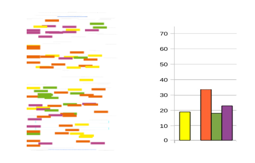
Case one, paper 441: A study of labour market information needs through employers' seeking behaviour. Sonia Sanchez-Cuadrado, Jorge Morato, Yorgos Andreadakis and Jose Antonio Moreiro
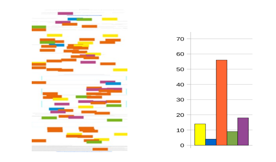
Both methods identify the most common vocabulary. In this case it is the conceptual one (orange). This paper describes knowledge representation techniques with computer support, which the two representations also show us. However, in the case of Texty, it can be seen that these techniques are discussed in the middle part of the paper (violet colour), whereas this was notseen with the bar chart.
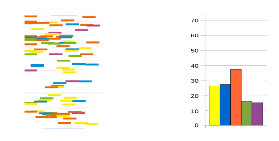
Case two, paper 445: Information behaviour research and information systems development: the SHAMAN project, an example of collaboration. Elena Maceviciute and T.D. Wilson
This paper has a conceptual tone (orange). Initially, in the background on long-term digital preservation, we can say that techniques that require computers are being discussed (for example: e-mail, word-processed documents and spreadsheets, as well as e-books, sound recordings, films, scientific data sets, social science data archives, are terms used in this paper). In the middle of the paper we saw a concentration of green points belonging to the experimental vocabulary. This coincides with the explanation of the data used by the SHAMAN program on the basis of interviews with users. Not all this information can be deduced from the bar chart.
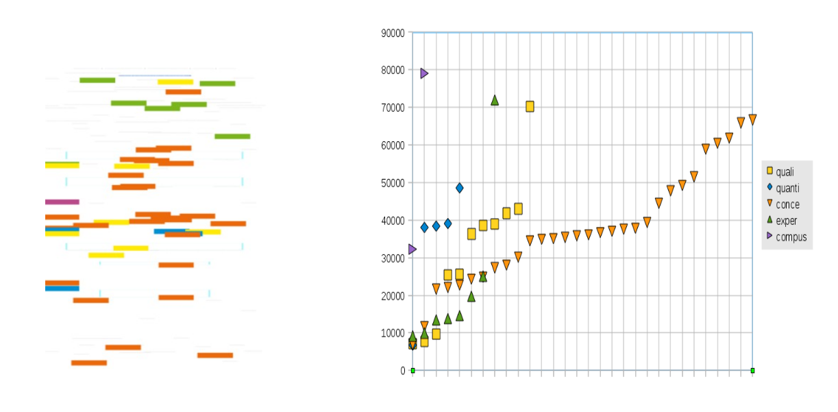
Case three, paper 450: Analysis of automatic translation of questions for question-answering systems. Lola García-Santiago and María-Dolores Olvera-Lobo
In this case we have a paper with a considerable presence of the five vocabularies. Here, the importance of being able to see the physical distribution of terms in the paper can be seen perhaps in greater clarity. Thus we can say that the paper starts with a conceptual tone, to then explain the method in an experimental tone. The paper does not require too much knowledge of data processing, although there are references to it in the first half. At the end there are references of a conceptual kind. In general, the paper has a qualitative approach, as yellow is distributed throughout. Again, none of this information can be extracted by the bar chart.
Texty and the line charts:
We used a line chart with the following coordinates: Y axis represents the position of the first character of the term. The X axis represents the number of terms for each vocabulary. Figure 11 gives an example of this representation.
Case four, paper 438: Dietary blogs as sites of informational and emotional support, by Reijo Savolainen
The reading of the line chart contributes more information on the structure and distribution of terms in the text than the bar chart does. Line chart shows very well the number of terms of each vocabulary. Been the Line chart more accurate in number of vocabularies than Texty. However, Texty is more suitable for everywhere use because it doesn't requite the use of axes and has a bigger range of readible sizes. For small sizes the line chart axes scales becomes unreadible.
Texty versus bar and line charts
The objective of our work is not to quantitatively study Texty's performance against other visualizations, taking this into account, both options, Texty and the charts, show the number of terms in each vocabulary, i.e., the general focus of a paper at a glance. The improvements introduced by Texty are:
- Texty shows the distribution of terms along the text.
- With Texty the conceptual structure of the paper can be seen: e.g. at the start there is a conceptual explanation; then the experimental part is developed; finally, the calculations in which there is intensive use of technology related and/or computer related operations.
- Texty doesn't need axes or coordinates and scales.
Conclusions
The development of this work allows us to point out a number of learned lessons about the complementary nature of Texty, its ability to encode information, and its non intrusive structure and technology.
Because of its complementary nature, Texty enriches lists of texts adding an image that physically represents the distribution of five conceptual fields along the text. Texty is not a replacement for classic search systems, but is proposed as a complement.
Texty's ability of encoding means that it is able to present distribution and structure of a text using only coloured dots that represent the ext itself.
Another conclusion we can draw is that Texty is not an intrusive solution from the point of view of the architecture of information. In this sense, Texty can be implemented without affecting the organizational criteria (e.g. order, relevance, recommendation or clustering) used to produce the retrieved list of documents.
Texty is a tool that can be implemented in an existing collection of texts and in is non-intrusive from a technological point of view. That means that it is not necessary to change or reprogram the storage system where the collection of texts lies. This easy implementation is presented as a critical advantage for future Texty implementations.
Finally, strictly speaking, from the point of view of information retrieval, the use of Texty is not adding any advantage (not improved indexing and search algorithms, for example). What Texty aims to do is to improve is the presentation of results: it complements the traditional list of results (generally based on a title and a short summary) providing information on the content and structure of the retrieved document without having to interact directly with the document itself (see Figure 3).
Future developments
We want to round off these conclusions by mentioning some future lines of development derived from Texty.
Texty can be exported to other backgrounds and other vocabularies, adapted to each case and it can be personalized to the extent that it shows us other vocabularies (colours) depending on the reader preferences or the texts represented. Representation can be expanded and texts sections separators added, which indicate, for example, the customary sections of an paper (intro, method, analysis, results, conclusions, in the case of the papers of Information Research).
Dynamic, personalized and folk-vocabularies can increase the efficacy of Texty, as can the use of different layers to represent any vocabularies, as wanted. The use of interactive images (sensitive to clicks on the mouse) allows Texty to navegate through the text in question.
As noted, the use of thesaurus would improve the representative capacity of the vocabularies used in texty.The adaptation of Texty for texts in a number of languages is another possible use: all you need are translations of the vocabularies.
Acknowledgements
Our thanks to: Jordi K. Nualart, Amelia S. Nacimento, Mar Canet (Catalonia), Sandor Herramhof (Linz, Austria), Dietmar Offenhuber (MIT USA) , Joelle Vandermensbrugghe (University of Canberra), and the Department of Information Science, Faculty of Information Science. University of Barcelona.
About the authors
Jaume Nualart is a PhD candidate in the Faculty of Arts and Design, University of Canberra and a research engineer at NICTA, Australia. MAS and MSc (Licenciatura) at University Autonomous of Barcelona He can be contacted at Jaume.Nualart@canberra.edu.au.
Mario Pérez-Montoro is a Professor in the Department of Information Science, at University of Barcelona, Spain. He completed his Bachelor's degree in Philosophy and Education from the University of Barcelona (Spain), his Master of Information Science in Organizations from the Politechnical University of Catalonia (Spain), and his PhD from the University of Barcelona (Spain). He has been visiting scholar at the Center for the Study of Language and Information (CSLI) at Stanford University (California, USA) and at the School of Information at UC Berkeley (California, USA). He can be contacted at: perez-montoro@ub.edu.