vol. 15 no. 2, June, 2010
vol. 15 no. 2, June, 2010 | ||||
To provide informative and easily usable Websites, it is essential that providers of library services learn about the real needs and preferences of their users. With this goal in mind the Faculty of Engineering, Lund University (LTH) performed a LibQUAL+® survey in the spring 2007 to form a clear picture of the users' opinions about the quality of the libraries services. LibQUAL+® is an internationally used tool developed by the Association of Research Libraries (USA) to measure service quality in libraries. It measures quality in three dimensions: Affect of service, Information control and Library as place (Cook & Heath 2001; Persson 2005). The Affect of service dimension refers to the human aspects of service. The questions relate to users' interactions with, and the general helpfulness and competency of, library staff. For the Information control dimension, the survey poses questions relating to the users' perception of their ability to find information in an independent and autonomous way. Library as place deals with the physical environment of the library as a place for individual study, group work, and inspiration.
In our application of the survey, library services were shown to have low scores on the Information control dimension: among the twenty-two items rated, the items in need of most attention were: 'A library Website enabling me to locate information on my own' and 'Making electronic resources accessible from my home or office'.The open-ended comments in the survey pinpointed the problem issues:
...overall I'm satisfied with the library service, but the information on the Web page could be better organized to make it easier to find databases and so on. It takes too many mouse clicks to get to the right place.
Mostly it is the searching for materials on the Web page that is not so good. It is usually complicated to find what you want and you get no clear view of the structure.
It was obvious that something had to be done about the problem. The results of the survey had clearly revealed some problems that we had been unable to see, since we, as librarians, had felt that the pages were well organized and contained easily accessible information. We did not think, however, that the answers to the LibQUAL+® survey provided a sufficient foundation for making the necessary changes in our Websites.
To gain more usable information about what worked and did not work for our users and also about what they needed from our Websites, we required a method that provided more detailed and specific information. Several possible methods or techniques were considered: focus groups, additional surveys, participatory design, evaluations, usability inspection and usability testing (Rubin 1994; Nielsen 1993; Mack 1994). Some libraries have chosen to use a combination of these methods whereas others, including ours, have chosen to concentrate on empirical usability testing. Our reason for choosing empirical usability testing is best explained by the words of Steve Krug in his book Don´t Make Me Think:
...if you want to know whether your software or your Website or your VCR remote control is easy enough to use, watch some people while they try to use it and note where they run into trouble (Krug 2000: 143).
We selected usability testing because we felt that direct observations of how students and members of faculty actually used our Websites would give us concrete insight into what the major problems were. The method was also chosen because it consists of interviews with each test participant to find out what they felt caused most problems and what Website content was most important to them. Hence our systematic quality approach consisted of two parts: a LibQUAL+® survey to identify problem areas and a usability test to screen potential alternative Website designs. We argue that this approach is a fruitful way to improve information quality. Therefore, our objective in the present study was to find the problems that our Websites caused for our users and to obtain information on the best design and content by focusing the usability study on two questions, one concerning navigation, the other content.
Surprisingly, there has so far been very little written on usability testing in Swedish libraries. The reason may be that they either do not test the usability of their Websites or online catalogues(OPACs), or perhaps they prefer not to publish the results. We found descriptions of only three Swedish projects: a) the Limit Project (Regionbibliotek Stockholm 2008), where nine counties in the middle of Sweden collaborated on making library Websites usable and giving easier access to electronic resources, b) the user-centred design project of LIBRIS, the new national catalogue of the Swedish university libraries (Lindström 2008), and c) the user directed development of the Website at Växjö University Library, in the South of Sweden (Gustafsson 2008). The LIBRIS project and the Limit Project used test methods similar to ours, with observation of people performing different tasks followed by debriefing interviews. Växjö used a variety of methods, such as card sorting and discussion groups but did not perform usability tests as we define them.
There are many articles in the library literature on usability testing in Canada and the United States but, to quote Rubin, '...the term usability testing is often used rather indiscriminately to refer to any technique used to evaluate a product or system' (Rubin 1994: 25). In this project we have defined usability testing as '...techniques to collect empirical data while observing representative end users using the product to perform representative tasks' (Rubin, 1994: 22). Letnikova (2008) gives a useful overview of the library literature on usability testing according to Rubins' definition. Letnikova collected twenty-two case studies from academic libraries in Canada and the United States between 1999 and 2004. Her paper focuses on the tasks in the tests. She argues that it should be possible to create standard tasks to test usability of library Web pages as well as to improve the method of testing. We agree with Letnikova that the most commonly used tasks relate to finding a book, an article, a database, interlibrary loans, and library services. Letnikova refers in her article to questions rather than tasks, and she suggests fourteen standardized questions. However, we found that by using tasks instead of questions, the list can be made shorter. In other words, why should anyone want to find the link to a library catalogue if they were not searching for a book? The same goes for finding a journal, electronic journal or an article. One and the same task can easily be formulated for finding a journal article in full text as well as for locating an electronic journal or an article. Furthermore a task where the participants are asked to find the library catalogue by its name is easier for the participant than a task to find a book by its author or title because the participant is given a clear clue about what to to look for on the Website.
It is important in usability testing that the tasks being used in the tests follow a scenario that is realistic. Since scenarios are used to motivate the participants, they should describe a situation that is likely when they use the Website (Rubin 1994: 179; Mack, 1994). In our test we used the scenario 'You have started a new project and need to find some new literature on your subject', a likely situation for a faculty member when using the Website. Since Web users are looking for something and want to find it as quickly and painlessly as possible (McGovern 2006: 9; Krug 2000), we believe that library Websites should be a tool for finding information for the intended target audience and not a showcase for all the things a library can do.
In the book Usability Inspection Methods (Mack and Nielsen 1994: 2) four basic ways of evaluating user interfaces are described: automatically (using evaluation software), empirically (testing the interface with real users), formally (using models and formulas), and informally (based on rules of thumb of the expert evaluators). Nielsen states that,
User testing with real users is the most fundamental usability method and is in some sense irreplaceable, since it provides direct information about how people use computers and what their exact problems are with the concrete interface being tested. (Nielsen 1993: 165).
In designing the tests we have used Rubin's handbook (Rubin 1994) since he very thoroughly describes how to prepare for the tests, what technology and place to use and how to create tasks. Four aspects of usability are described by McGillis (2001: 356), and Rubin (1994: 19):
In our test we have measured usefulness (how many participants were able to complete the tasks), and effectiveness (the time it took to complete the tasks). We have also measured the participants' feeling of ease of use and their perception on what they need on the Websites. Before the test we wrote a test plan (Rubin 1994: 106) for each library and user group. We collected background information on the participants in a questionnaire before the tests to assess to what extent they had used the library Website. After the test the participants were given a post-test questionnaire to record their perception of the ease of use of the Website and to collect their ideas for improvement. Finally, we had a debriefing session with the participants to learn more about the problems they encountered with the Website and to find out what content they would like the Website to have. Each participant was given gift certificates for a local cinema as a token of our gratitude.
Understanding who our users were and what they might need from our Websites had to be the first step in the redesign process (Bordac 2008: 116; Krug 2000) so we started by defining the main user groups of the three Websites. For two of the sites it was relatively easy since the Library of E-huset targets mainly faculty and the Study Centre Library targets undergraduate students. The Library for Architecture and Design, however, has a broader target audience: they provide service to undergraduate and postgraduate students, and faculty. The scenarios and set of tasks were adapted to fit the target group for each library (Table 1).
| Website for Library for Architecture and Design Target group: students |
|---|
| Scenario: A-building is going to be redesigned and the faculty wants to involve the students. You are required to give a plan for the new building |
| Tasks: |
| 1. Find information on Klas Anshelm and the buildings he designed. |
| 2. You want to get an overview of recent architecture schools in the world. |
| 3. You want to know more about different materials. |
| 4. You get stuck in your searches and need help. The library is closed. |
| 5. One of the books is not for loan and you want two of the blueprints. |
| Website for Library for Architecture and Design Target group: Faculty |
| Scenario: You have started a new project and need to find some literature on your subject |
| Tasks: |
| 1. You want to find articles within your subject. |
| 2. You want to register your latest article in LUP (the Lund University Publications repository). |
| 3. You have found some books in the University Library and you want to pick them up at your own library. |
| 4. You have found a book at the Royal University College of Fine Arts in Stockholm and you want to borrow it. |
| Website for Library of E-huset Target group: Faculty |
| Scenario: You are a researcher in a specific field and want to find information through articles. You also want to find books from another library in Sweden. You want your students to attend an information seeking course and need information of what the library can offer. You also need to register your own articles in LUP (the Lund University Publications repository). |
| Tasks: |
| 1. You want the first issue from 2006 of the journal IEEE Software, both in print and in electronic version. |
| 2. You want to borrow a book that is not available at the Lund University Libraries. |
| 3. You want to find out if there are any library courses in information literacy for your students. |
| 4. You want to know why the articles you have submitted to LUP do not show in the list on the department's homepage. |
| Website for Study Centre Library Target group: Students |
| Scenario:Your group of students is going to write a paper and you need to check a few things before you start work. |
| Tasks: |
| 1. You want to know what opening hours the Study Centre has in May. |
| 2. You want to know if you can borrow books from other libraries and if it will cost anything. |
| 3. You want to know if you can get help on information retrieval. |
| 4. You want to know how to log on to the Wi-Fi. |
| 5. You want to find out if there is a computer for students with sight impairment and if you can reserve it. |
We tried to make the scenarios with their sets of tasks as realistic as possible, but we also tried to avoid clues that would make it easier for the participants to solve a task. For example, we were careful not to mention the name of the relevant library catalogue or the name of the databases. There are various ways of gathering sets of tasks, such as asking the users why they visit the Website and what problems they experience (Ascher 2007: 43), adapting exercises from other usability tests (Oldham 2008: 230), using the structure of the Website (McGillis 2001: 358), or anticipated problems (Cobus 2005: 233). We decided to use questions asked by users in the reference desk (Augustine 2002: 357).
The participants were students and faculty within the Faculty of Engineering. Following Krug's advice to 'Take anyone you can get (within limits)…' (Krug 2000) we selected students at random in the three libraries and contacted faculty via e-mail. Rubin (1994), Krug, (2000) and Nielsen (2000) mention that four to five participants will be sufficient to expose 80-90% of the usability deficiencies. We decided to have six participants for each scenario, in case one or two did drop out. (The final test sessions had to take place during the examination period, so we knew there would be a risk of that happening.)
The test sessions were conducted at the Usability Lab at the Department of Design Sciences, LTH. The lab resembled Rubin's Electronic observation room setup (Rubin 1994: 54). The lab consisted of two rooms: one observation room and one test room. The test monitor and the participant were located in the test room and the person videotaping in the second room. The disadvantage mentioned by Rubin that the test monitor's behaviour can adversely affect the tests was discussed within the project group. On the other hand Rubin describes another problem with tests where the participant is alone in the test room as the '… "guinea pig" syndrome, with the participant feeling overly self-conscious during the test's (Rubin 1994: 57). We decided that in our tests it would be better that the test monitor stayed in the same room as the participant. Yet another problem that Rubin mentions is the test monitor's familiarity with the product causing her/him to influence the participant (Rubin 1994). In order to minimize this risk we decided to monitor the testing of each other's Websites rather than the one we were responsible for ourselves. We also tried to avoid testing participants whom we knew personally (faculty mostly). We conducted the tests in pairs: a test monitor and a video recordings operator. The test monitor, who stayed with the participant all through the test, distributed a tape consent form, background questionnaire, the scenario with tasks and post-test questionnaire to each participant and led her/him through the test. After the tests the test monitor did a debriefing session to find out more about the problems the participant found during the test and also to get feedback on the Websites. The video recordings operator was responsible for the recordings and the adjustment of the equipment. We had two cameras: one recording the participants' face and one recording the computer screen. We also had a microphone recording the participants' voice. Each participant was asked to perform four to five tasks while thinking aloud and describing what s/he was doing and why. The testing sessions were planned to last maximum one hour but did generally not last that long, rather twenty to forty minutes. In many cases the debriefing interviews lasted longer than the test itself and were often more informative. After the test period we spent about two weeks going through the recorded results, formulating our conclusions and discussing how to act on them to further improve the design of the three library Websites.
Of the twenty-four participants sixteen had used the library Websites previously. Previous use appeared to have effect on how well they performed the tasks. Those who had used the Websites before the test were asked to grade on a scale from Yes, definitely to No, not at all if they thought the site contained what they needed for their work. Most participants graded in the middle or close to the middle of the scale. No one graded as No, not at all or Yes definitely.
The audiotapes from the tests were analysed to see how many participants were able to solve the tasks (usefulness) and the time each task took (effectiveness) to indicate to what extent participants were able to find what they were looking for (Table 2). The search path the participants used was recorded manually to see where on the page the participants looked for links.
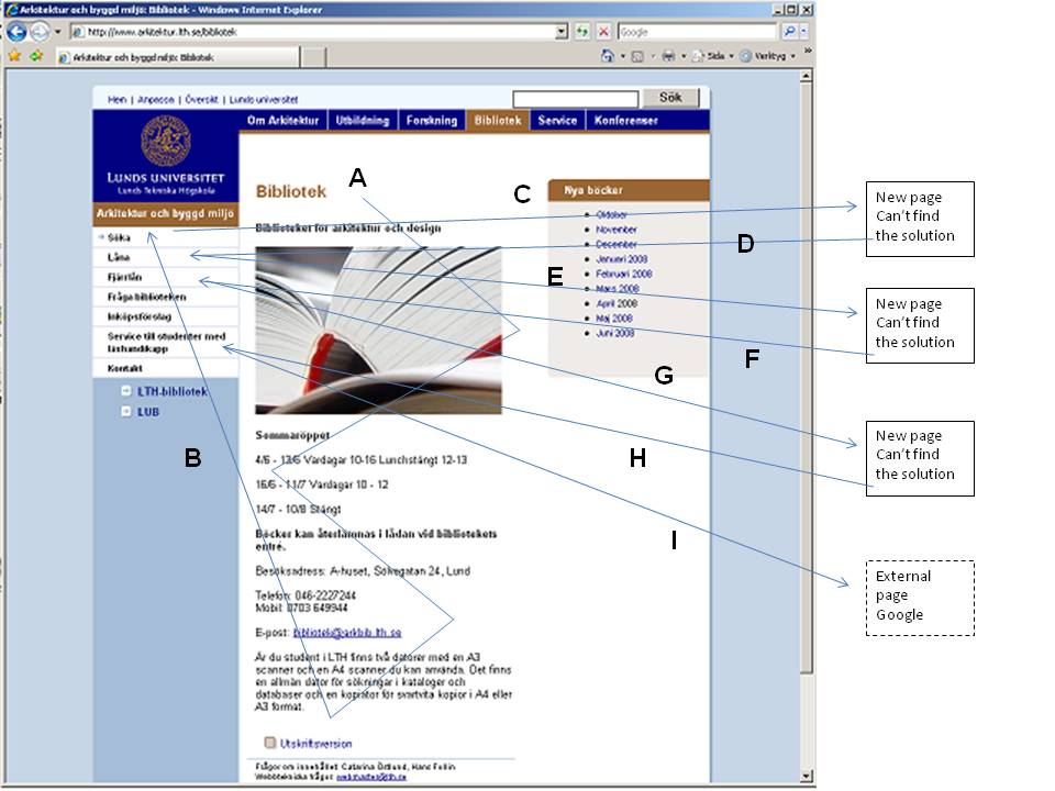
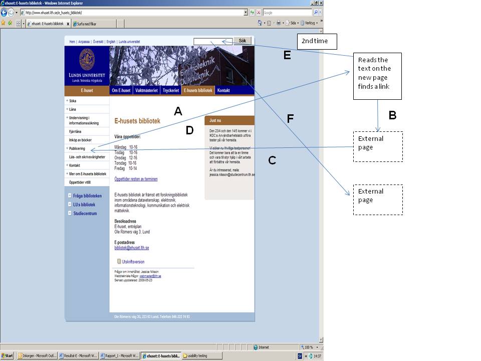
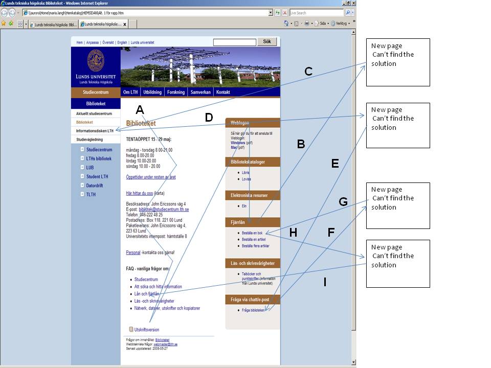
Table 2 displays the percentage of participants who were able to solve each task and the maximum and minimum task-solving times. There are references to examples of search paths (Figures 1, 2, 3) for the participant with the longest time required to solve the task.
| Website for the Library for Architecture and Design, n=6, students | ||||
| Task | Percentage of participants able to solve the task | Max time (min : sec) | Min time(min : sec) | Search path |
| 1. Find information on Klas Anshelm and the buildings he designed. | 83% | 3:08 | 2:37 | |
| 2. You want to get an overview of recent architecture schools in the world. | 33% | 7:20 | 1:30 | See Figure 1 |
| 3. You want to know more about different materials. | 83% | 5:37 | 0:43 | |
| 4. You get stuck in your searches and need help. The library is closed. | 83% | 2:04 | 0:43 | |
| 5. One of the books are not for loan and you want two of the blueprints. | 50% | 6:00 | 0:49 | |
| Website for Library at Architecture and Design, n=6, faculty | ||||
| 1. You want to find articles within your subject. | 100% | 4:21 | 2:00 | |
| 2. You want to register your latest article in LUP. | 17% | 3:37 | 3:37 | |
| 3. You have found book in the University Library and you want to pick them up at your own library. | 33% | 4:04 | 1:21 | |
| 4. You have found a book at the Royal University College of Fine Arts in Stockholm and you want to borrow it. | 83% | 2:28 | 1:07 | |
| Website for the Library of E-huset, n=6, faculty | ||||
| 1. You want the first issue from 2006 of the journal IEEE Software, both in print and in electronic version. | 66% | 7:24 | 2:28 | |
| 2. You want to borrow a book that is not available at the Lund University Libraries. | 83% | 1:46 | 0:53 | |
| 3. You want to find out if there are any library courses in information literacy for your students. | 100% | 5:01 | 0:32 | |
| 4. You want to know why the articles you have submitted to LUP do not show in the list on the department's homepage. | 17% | 5:57 | 5:57 | See Figure 2 |
| Website for the Study Centre Library, n=6, students | ||||
| 1. You want to know what opening hours the Study Centre have in May. | 83% | 0:55 | 0:30 | |
| 2. You want to know if you can borrow books from other libraries and if it will cost anything. | 33% | 6:00 | 0:50 | See Figure 3 |
| 3. You want to know if you can get help on information retrieval. | 50% | 0:58 | 0:30 | |
| 4. You want to know how to log on to the Wi-Fi. | 100% | 0:55 | 0:35 | |
| 5. You want to find out if there is a computer for students with sight impairment and if you can reserve it. | 100% | 0:50 | 0:25 | |
For each task in the test a maximum time was set. If a person exceeded that time the test leader asked the person to go on to next task. The time recorded is the time from the start of the task until the participant says he or she is finished. Since each library has a different target audience the tasks are different and are presented under each library in Table 2. There is, of course, a time difference between the participant solving the task rapidly and the participant having more difficulty (Table 2). Comparing the test results for the three libraries indicate that Study Centre Library's Website was the most effective since the participants using this Website were able to solve their task in the shortest amount of time.
Usefulness is highly correlated with effectiveness since it takes more time to solve a task that is more difficult. The tests were intended to identify the most problematic features with the Websites, measured as the ability for participants to solve the tasks. Overall, the most difficult tasks were: Find information on your registered articles in LUP, and You want to register your latest article in LUP (Table 2). Both these tasks were aimed at faculty members using the Websites. For each there was only one person able to find a solution. The problem with both these tasks was that the participants did not see the relevant link on the page in question. There was simply too much text surrounding the links.
The most problematic tasks for the students were: You want to get an overview of recent architecture schools in the world, and You want to know if you can borrow books from other libraries and if it will cost anything, with only two students (33%) succeeding at each task. The inter-library loan task turned out to be difficult because a complete solution required answering two questions and most of the participants stopped half-way.
Other problematic student tasks turned out to be: One of the books is not for loan and you want two of the blueprints, (solved by only half of the participants) and You want to know if you can get help on information retrieval. The problem in the first task was locating the button on top of the page that led back to the first page. In the second, the students who failed to find the proper link said they would rather contact a librarian.
The easiest tasks were to find articles within the participant's own subject, find a course in information retrieval, logging on to the Wi-Fi, and finding information about customized computers for dyslexics. All participants solved these tasks.
Besides analysing the audiotapes for the participants' ability to solve the tasks and the time to solve them, we manually recorded the search paths the participants used. We believe that these examples clearly show the problems with finding things on the three Websites and how participants navigate on the Web pages in pursuit of the solution to the tasks. It is a problem to show the search paths for all tasks and all participants so here we only show three examples of search paths, one for each Website. Figures 1, 2, 3 shows the three different Websites and an example of one participant for each Website trying to solve a task. The examples show a general outline of the search paths for the participants who had the most difficulty with a task. The Websites have a similar layout in common with Lund University as a whole, but the three library Websites vary slightly according to the librarians' perception of their target audience.
In Example 1 (Figure 1) the task is Finding an overview of recent architecture schools in the world. The participant starts at the top of the page and scan the page for links, first in the main section of the page, then in the left hand menu. He follows the link Söka (Search), scans through the new page without finding anything and returns to the first page. Next the participant chooses the link Låna (Borrow). The participant still cannot find what he is searching for on the new page, returns to the main page and so on until he asks if it is OK to use Google. The participant has by now tried nearly all the links on the page without finding what he needs. Time to solve the task is 7:20 min (Table 2). The intended solution to this task is to use the search link and then, on the new page. a link to an article database.
The next example (Figure 2) is from the Library of E-huset and the task is, You want to know why the articles you have submitted to LUP do not show in the list on the homepage. The participant (a faculty member) starts by following the link Publicering (Publishing) in the left hand menu. He then reads the text on the new page (which is the correct page) but is unable to find the correct link. Instead he chooses a link leading to a page on publishing for the whole university. The participant reads this page without finding what he is looking for and goes back to the main page. He once more uses the link Publicering and reads the following page again without finding the correct link. He then uses the search box on top of the page and searches the whole university Website. This time he finally finds an external page with the link he needs. Time to solve the task is 5:57 min (Table 2).
The third example (Figure 3) is a participant using the Study Centre Library pages. The task is. You want to know if you can borrow books from other libraries and if it will cost anything. The participant starts on the top of the page and scans the page to find a suitable link. He then goes to the right hand menu, scans this and finds the link Fjärrlån (Inter-library loans). This leads to another page which the participant looks over without finding the relevant information. He goes back to the first page and clicks on the link Informationsdisken LTH (Information desk LTH). On this new page he is once more unable to find any helpful links so he goes back to the first page and tries the link Fråga biblioteken (Ask the library). On failing to find what he is looking for there he goes back to the starting page and tries the link Fjärrlån again without any luck. He finally goes back to the main page, finds the link Lån och fjärrlån (Loans and Inter-library loans) under FAQ and on this page he finds the right answer. Time to solve the task is 6 min (Table 2).
In all the tasks the participants usually scanned the entire page to look for links that could be perceived as relevant. Many of the faculty participants clearly said that they never read the text on the pages they only look for links. Many participants from all the user groups used trial and error to see if they hit the right link.
Despite the fact that many participants experienced problems solving their tasks the post-test questionnaire showed that the participants in general perceived the Website as quite easy to use. Significantly, one of the student participants wrote in the post-test questionnaire: 'Easy to use but hard to find things'.
Table 3 summarizes the participants' wishes for the contents of the library Websites. These were collected in the post-test questionnaire and the participants were not able to see the Website during this time.
| The students want ... | The students do not want ... |
| - The possibility to search for books directly on the library Website without entering the catalogue - Information on the library premises (Is there a scanner/printer available) - A link to inspirational material - A clear layout that tells you where you are - The possibility to search within the page - A link page to other study related pages - The FAQ placed in the top right corner - A clear connection to the faculty pages - Opening hours - Link to page for students with reading disabilities on the top page - Link to information about theses - Information on how many people is seated at the moment in the library |
- Links to University Web pages - A lot of text, long sentences - Links both on top of the page and to the left - Too little information |
| The faculty members want … | The faculty members do not want … |
| - Link to LUP [Lund University Publications repository] on the top page - Link to ELIN@Lund [front-end to all journals and books available in electronic versions] on the top page - Link to DOAJ [Directory of Open Access Journals] on the top page - Link back to the top page from the other pages - A catalogue with only the books in the specific branch library - The possibility to search several databases at the same time - Links to future conferences to attend - Links to journals to publish in - Information on patents - Links to relevant databases - A list of new books in the library - A list of dissertations at the faculty - The possibility to leave suggestions for book purchases - An English version of the page - Opening hours and contact information |
- A lot of text - provide only links - Information already available on Lund University Libraries Website |
Many of the participating students who tested the Website of the Library for Architecture and Design wrote that the layout of the pages was obscure. They wanted to be able to search only the branch library's Webcite - the currently available search function applies to the whole Faculty of Engineering. The students also expressed that it was difficult to identify their library Website since the layout is the same for the whole university. Another wish was to have more graphics on the main page. The Website for the Library for Architecture and Design had been set up with the students as the main target group, so the faculty participants lacked direct links to the services they use the most such as the link to electronic journals, databases, and ELIN@Lund. Those links that were available were difficult to find because of the quantity of text on the pages. The faculty members also asked for links to forthcoming conferences and competitions in architecture and design and suggestions for journals to publish in.
For the Study Centre Library the participants found the FAQ function helpful, but they suggested some improvements in the layout, such as locating it to the upper right corner of the Website and group the subjects in a better way. Other wishes were the possibility to search for books directly on the Website without entering the catalogue, and information about available study space in the library.
As for the researchers at E-huset the debriefings showed them to be frequent users of the central Lund University Libraries Website (LUB). To be a valid local complement to this site, the E-huset library site should provide links to upcoming conferences, suggestions for journals to publish in and information about commercialization of research results. Many of the researchers said they would visit the library rather than its Website to get the answers they needed.
Generally speaking, the usability tests showed reasonably well what worked and what didn't. The debriefing interviews gave complementary information both about how the participants perceived the tested Websites and about their views on Websites in general. Some of the problems with the Websites were easy to correct, for example the back button on Library for Architecture and Design's Website and the links to Lund University Publications repository (LUP). But some of the problems with navigating the Websites are due to the fact that all the libraries have to deal with the overall style sheets of the university's Web, with predetermined sizes and colours of fonts, bars and frames etc. The Website of the Faculty of Engineering (which the tested libraries are part of) carries a 'search this site' box applied to the whole Faculty. This makes it virtually impossible for the libraries to have a search box aimed at the library services, which is unfortunate since this is a request repeatedly heard from the students.
As a result of the tests the three libraries' Websites were redesigned. These designs are shown in figures 4, 5 and 6 below.
For the Libraries of Architecture and Design and E-huset, test results led to thoroughly rethinking the content and layout of each library's Website.
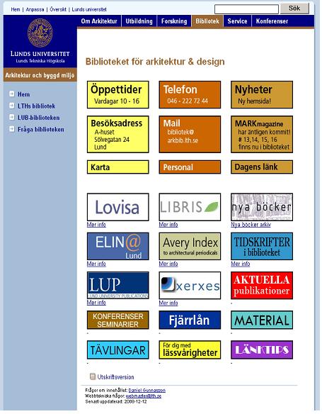
The student user group of the Library for Architecture and Design wanted a more visual approach. Therefore the new Website emphasizes pictorial logotypes that link to the services (Figure 4). Below those there are links to more information. The logos give the Website a colorful and distinctively different look unlike other library Websites within the university, which makes it easy to recognize and the new version does not have as many layers of Web pages as it had before; instead it has one single page with links to both the OPAC and ELIN@Lund, a feature the faculty wanted.
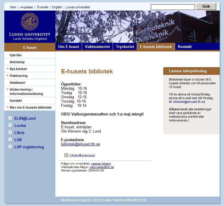
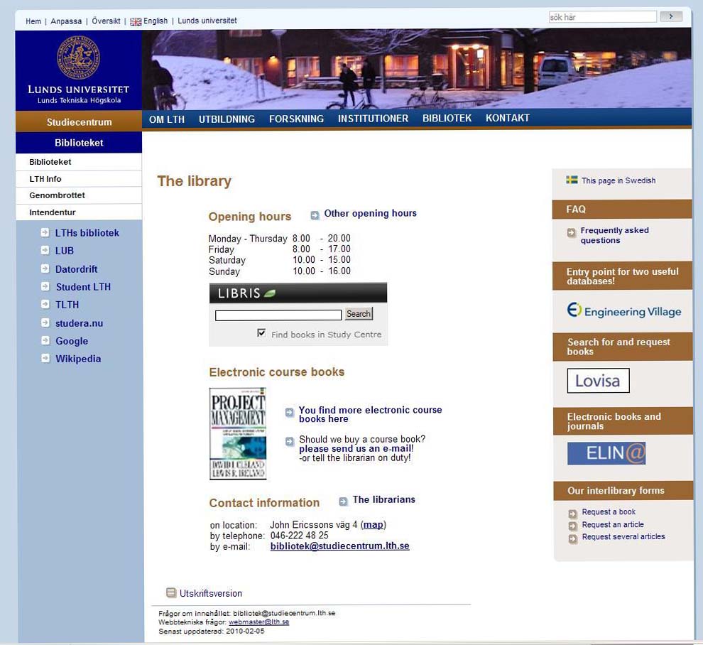
The Library of E-huset decided that a more traditional layout was best suited and focused on changing the content of the Website and on cleaning the page up by removing long informational texts (Figure 5). The new focus is on links leading directly to common resources, since the researchers are familiar with these. Some of the links have remained, although with shortened texts, for example, opening hours, interlibrary loan, and database links. The link to LUP stands out more on the new page (Publicering) and is easier to find. To strengthen the local connection the page displays a list of new books in the branch library. From every new entry there is a link straight into the OPAC in order to enable everyone to see whether the book is available or not. Other additions are a presentation of recently published papers from the department, recommendations of conferences to visit, and journals to publish in.
The main feature of the Website of the Study Centre Library is now a search box for searching for books available at this specific library without entering the library catalogue (Fig. 6). Various items of information previously featured as separate links have been incorporated in the FAQ. As the demand for course books is very high, a new digital course book is introduced each week by means of a picture of the book cover linking to the text. We have however not yet been able to show how many people are seated at a specific time in the library, as the student participants requested.
In the redesign we have tried as much as possible to take into account the users advice on what they need on the Websites. The students of the Library for Architecture and Design wanted inspirational material for their exercises. But their teachers want them to find such material for themselves using the library. This is a conflict of interest and we decided to follow the teachers' advice. Many of the faculty members at Library of E-huset said that they do not need the Website since they use the one for all the Libraries at Lund University (LUB). But it is difficult to customize a Website for a very narrow target group when the Website has to suit all the disciplines at Lund University. For now we will keep the redesigned Websites shown in this test.
Testing usability is not something you do once; it is an ongoing search for perfection. We conclude that the focus on testing is to find out what does not work and where users run into trouble. We believe we have found that in this test and that our redesigned Websites will work better for our users than the old ones. The Faculty of Engineering at Lund University will do the LibQUAL+® survey again 2010 and we hope the improvements we have done will show in the survey. We have learned a lot and plan to go on testing in the future to make the Websites even better and easier to use.
Ann-Christin Persson is a Principal Librarian, Maria Långh, and Jessica Nilsson are Librarians at the Study Centre Library, Lund University, Faculty of Engineering, Sweden. Both Ann-Christin and Jessica received their Masters of Library and Information Science from University of Borås, Sweden. Ann-Christin Persson can be contacted at: ann-christin.persson@studiecentrum.lth.se
| Find other papers on this subject | ||