The relationship between research method and visual display: a study of conference proceedings in the field of knowledge organization.
Alon Friedman
School of Information, 4202 E. Fowler Ave, CIS 1040, University of South Florida, Tampa, FL 33620, USA
Introduction
'A picture is worth a thousand words' is an apt testament to the power of visualisation in today's data-driven society. Visualisation has become a universal platform for displaying data. But visualisation has different meanings in different fields and different cultures. For example, in the field of computer science, the term visualisation often means generating images from complex multidimensional data sets as an interpretation tool or method, according to Schroeder and Martin (2004). Tufte (1990, 1997) makes the connection between visual display and quantitative information by demonstrating that this has happened throughout the history—from cave drawings to computer visualisation.
In order to conduct any type of research, researchers are required to employ a theoretical framework and method. The term research method stands for the tools and procedures the researchers use to find new knowledge. The term research methodology, on the other hand, may be distinguished from research methods as the theory that the researcher determines fits to the data collected. Many researchers in the field of information science and in particular in the field of knowledge organization have studied the subject of research methodology; some have examined empirical data by analysing word references and classification in catalogs, while others have surveyed the theoretical aspects of research methodology.
This study raises the following research questions:
- RQ1: What is the relationship between research method and visual display used by researchers to present their findings at one of the leading international conferences in the field of knowledge organization?
- RQ2: What can predictive analytics tell us about directions in research method and visual display as employed by these researchers?
The field of knowledge organization has often been concerned with 'ordering of what is known', particularly for the purpose of information retrieval (Smiraglia, 2002, p. 334). However, examining the research methods and the types of visual display that researchers use to present their research provides a new look at the domain. I begin by looking at all conference proceedings of the International Society of Knowledge Organization from 1990 to 2010 to survey general characteristics of presentations in the field of knowledge organization. In the second phase, a random sample of the proceedings is examined more closely to determine the relationship between research method and visual display using predictive analytics. I conclude with my findings and recommendations for future research.
Visualisation
Visualisation as a form of human communication can be traced back to the development of language, signs, and sounds in ancient times. In the present day, it is most often a visual-mapping process in which computer representations are mapped to perceptual representations, using encoding techniques to maximize human understanding of the data. Visualisation is often defined as a tool or method for interpreting data fed into a computer and for generating images from complex multidimensional data sets. According to Heer, Bostock, and Ogievetsky (2010), the goal of visualisation is to aid our understanding of data by leveraging the human visual system's highly tuned ability to see patterns, spot trends, and identify outliers; but it also could be a visual proof to judge the reasonableness of the data.
The term visualisation is defined in various ways by different authors in different fields. For example, Johns and Lenski (2001) define visualisation for purposes of education and literacy perspective as follows:
When we read we can often make pictures/maps in our minds about what is happening in the story. Pictures can help us understand and remember what we read. When I think about what is going on in the story, I make a personal connection to the picture in my mind. (p.15)
From the field of computer science, McCormick et al. (1987, p. 97) offer the following definition:
Visualization is a method of computing. It transforms the symbolic into the geometric, enabling researchers to observe their simulations and computations. Visualization offers a method for seeing the unseen. It enriches the process of scientific discovery and fosters profound and unexpected insights.
From whatever viewpoint visualisation is defined, its power comes from its ability to capture more complex conceptual structures than words can (Purchase, Andrienko, Jankun-Kelly and Ward, 2008). Tufte (1990) introduces the subject of quantitative visualisation by looking at the history of visualisation to illustrate the power of points, lines, coordinate systems, numbers, symbols, words, shading, and colors to display the fruits of the quantitative methods these researchers employ. This was the first time that research methods under the quantitative paradigm were directly connected to how the visualisation was displayed. According to Tufte, visualisation must tell the truth behind the data: 'Every single pixel in the visualization should testify directly to the content of the data' (1990, p. 5). The second attempt to establish a connection between visualisation and research method was published by Cleveland (1985). He assigns visualisation types based on specific statistical methods and sorts the visualisation types based on their use with univariate, bivariate, trivariate, hypervariate, and multiway data. According to Cleveland, visualisation is connected to data and data analysis, and cannot be separated.
Wilkinson (2005) takes a closer look at grammar rules for creating visual graphics and also connects visualisation to statistical methods. He reports that some visualisation platforms do not share the same grammar rules as others in cases where the grammar of graphics takes us beyond a simple numeric chart. According to Wilkinson, since visualisation does not have grammar rules, as we are accustomed to seeing with text, we need to continue to explore the syntax and linguistics of visualisation. While new technologies and communities sharing information allow for the development of new visual displays of data and statistical analytics, I did not find any study that examined the relationship between the research methods and the visualisation platforms that researchers use in specific domains and in particular in the field of knowledge organization.
The domain of knowledge organization
In the domain of knowledge organization, many researchers have employed and discussed visualisation as part of their research. In 2013, for example, the Universal Decimal Classification conducted a seminar focused on visualisation in knowledge organization, where twenty-four papers were presented. Recent research examines the history of knowledge organization to report that visualisation was even a part of the process that the founders of knowledge organization used to simplify their classification schemes. For example, Rayward (2013) and van den Heuvel and Smiraglia (2013), in studying the work of one of those founders, Paul Otlet, explore his implementation of visualisation as part of developing classification schemes. White and McCain (1998) utilize co-citation analysis in the Information Science domain to present their findings regarding visualisation. Börner, Chen and Boyack (2003) address the subject of visualizing knowledge by examining different technologies and statistical methods. Their research focuses on bibliographic data structure. They discuss the general process for analysing this type of data, its unit of analysis, and the layout of different designs and interaction techniques to model this type of data. Friedman (2006. 2010) and Friedman and Smiraglia (2013) employ the term concept map to examine the relationship between the term concept and its meaning. Friedman employs Novak and Gowin's (1984) definition of the term concept mapping.
However, a review of the literature shows no attempt by knowledge organization researchers to classify visualisation platforms according to the research methods that employ them. The only study with such a focus was conducted by two researchers in the field of communication management, Lengler and Eppler (2007), who created a periodic table of visualisation methods, shown in Figure 1, that helps classify and organize different visualisation methods and visual patterns.
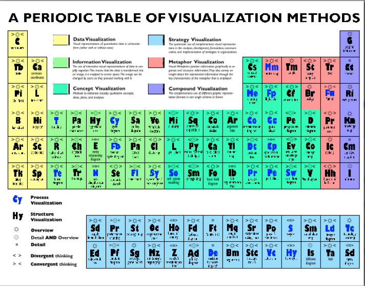
Their periodic table consists of six visualisation groups: data visualisation, information visualisation, concept visualisation, strategy visualisation, metaphor visualisation, and compound visualisation. Under the six groups, they assemble eighty-eight visualisations. Each group has its own visualisation mode that reflects the type of visual patterns it assembles. For example, the data visualisation group aims to answer questions of how much and why, that arise in research. Graphic representations in this group include pie charts and line graphs, which are the most common platforms for presenting descriptive statistics.
The information visualisation group describes networks. It is defined as the use of interactive visual representations of data to amplify cognition. Examples of visual patterns in this group are tree maps, flow charts, and data maps. The next group is concept visualisation, which uses qualitative methods to elaborate concepts and ideas. Concept visualisation is presented as a two-dimensional graphic display, with concepts usually represented within boxes or circles with lines and arcs connecting them. This group includes decision trees, concept maps, and other diagram formats. The metaphor visualisation group, which aims to capture complex insights from the data though the key characteristics of the metaphor that is employed, includes bridge, tree, and metro map charts. The strategy visualisation group makes systematic use of complementary visual representations to model the processes of analysis, development, formation, communication, and implementation. In this group, chain-and-spray diagrams illustrating supply and demand are the most common platforms.
The last group is compound visualisation, which includes the use of different graphic representation formats in a single schema or frame. Visual patterns in this group include knowledge maps, cartoons, and graphic facilitation. In this study, I use the Lengler and Eppler (2007) classification system, because of the in-depth diversity of the visual display that consists of eighty-eight visualisation methods, and recognition of the system among visualisation researchers, Harris (2007) and Few (2012).
Research methodologies in knowledge organization
There has been tremendous growth in research methodologies and data manipulation. Throughout, the essence of the term research methodology remains the same, with the aim of providing the researcher with a common theoretical structure for solving the research problem, whereas the term method stands for the actual procedure of solving the problem. In library science, and especially in knowledge organization, numerous researchers have examined the subject of research methodologies and its methods. Still, according to Powell, Baker, and Mika (2002), there is a need for more research and more research methodologies in the field in order to promote better understanding on how to address a research problem among librarians. Swisher (1986, p. 175) reported: 'Research is not a process that is the responsibility of others, research is a way of knowing, a way of making better practical decisions that is the responsibility of each of us'. Traditional knowledge organization approaches to research methodologies have developed, been maintained, and evolved over the years (Babb, 2005; Olson, 1995; Lopez-Huertas, 2008; Strout, 1969). According to Hjørland (2010), the question 'what is the scientific methodology?' should be viewed through the epistemology paradigm. However, there is a need to make a distinction between epistemological views and the methods based on them, especially in knowledge organization research.
White (2012) reviews research methodologies with regard to the theoretical framework of metadata and subject-term creation, identifying three groupings: cataloging, classification, and metadata. Based on her report, these practices provide a strong foundation of research methodologies to investigate knowledge organization approaches to assisting library users in accessing information. According to Bhattacherjee (2012), the history of research methodologies in social science has addressed two subjects: the philosophical aspect and empirical data. White's (2012) discussion, however, refers to neither the philosophical aspect of research methodology nor the visualisation aspect.
The term research has a philosophical dimension. Hjørland (2001) identifies the term research in conjunction with the term methodology as a protocol or way of carrying out a given piece of research to obtain knowledge, where the most frequently used framework of research is supported by the epistemology paradigm. He later reports, using the epistemology paradigm, that the term method can be applied to six approaches commonly found in the field: facet-analytical, information retrieval, user-oriented, cognitive-analytical, bibliometric, and domain-analytical (Hjørland, 2008). Tennis (2008) provides another approach to the term method under the epistemology paradigm, which he refers to as techniques that form a practice that carries with it the knowledge needed to have a result faithful to the chosen epistemology. Smiraglia (1987), Svenonius (1981), and Wilson (1999, 2002) discuss research methods in relation to the development of retrieval tools supporting Hjørland's epistemological framework as the basic of research in the field of knowledge organization.
With regard to the empirical aspect, Powell, Baker and Mika (2002) call for more and better research methodologies in the field. McIlwaine and Williamson (1999) and McIlwaine (2003) survey information science literature from 1988 to 1998 and then from 1998 to 2003 to report that the quantitative method is the leading method in the field. In their most recent publication, Ibekwe-SanJuan and SanJuan (2004) report that more technological research methods were employed from 1998 to 2008 than had been used in the past. Fuller, et al. (2014) report that many information researchers tend to take the best theoretical methodologies at hand, without considering much about the underlying epistemological assumptions of their studies. I did not find any discussion, however, of the theoretical or empirical data aspects of research methodology as they pertain to visual representation in the field of knowledge organization.
In the field of visualisation, several researchers address the role of research methodology. Tufte (1997) reviews the history of visualisation under the quantitative paradigm; however, he never looks beyond the quantitative paradigm. Craft and Cairns (2008) provide an overview of research methodologies to help designers create their own visualisation framework.
Overall, knowledge organization researchers are studying the subject of visualisation. I did not find any research, however, that examines the relationship between the types of research methods the researchers utilize and the types of visual representation used to present their findings in the field of knowledge organization.
The current study
In this study I have used an empirical methodology to examine how authors have employed their research methods and the visualisations used to display their results, asking the research questions set out above.
The objective is to study the relationship between the research methods employed by authors who presented their work at International Society of Knowledge Organization conferences and the visualisations they used to present their results. For the present study, my first sampling frame was the entire population of formal proceedings in the domain of knowledge organization. A general review of academic publications in the field (journals, conference proceedings, dissertations and monographs) reveals that researchers have used different types of visualisation and different types of research methods more often in conference proceedings than in other publications. Thus I decided to examine the entire proceedings of these conferences (1990-2010) as my first phase. In order to address the second research question, a second phase was conducted. In this phase, I took a random sample of proceedings to determine the relationship between the method researchers used and the visualisations they employed to display their findings.
To accomplish the research objective, I first analysed and recorded every conference paper in which the author(s) used a visual display. I recorded the research method utilized in the research as well as the type of visualisation employed. Three operational definitions were developed to guide this study.
First, I defined visualisation as a representation of the data in visual format. More specifically, I employed Lengler and Eppler's (2007) six categories of visualisation: data visualisation, information visualisation, concept visualisation, strategy visualisation, metaphor visualisation, and compound visualisation. All visualisations in the study were classified according to these categories.
Second, I defined research paradigm. Merriam-Webster's Collegiate Dictionary, 11th edition (2005) defines paradigm as 'an example or pattern: small, self- contained, simplified examples that we use to illustrate research procedures, processes, and theoretical points'. The most quoted definition of a paradigm is that of Thomas Kuhn (1966, 2000), who defines paradigm as the underlying assumptions and intellectual structure upon which research and development in a field of inquiry is based. Patton (1990) adds to Kuhn's definition by describing a paradigm as an interpretative framework that is guided by a set of beliefs.
In this study, I used the three paradigms advanced by Tashakkori and Teddlie (1998, 2003) as those most often used in social science research: quantitative research, qualitative research, and mixed research. According to them, quantitative research relies on the collection of quantitative data to test a theory composed of variables, measured with numbers, and analysed with statistical procedures, in order to determine whether the predictive generalizations of the theory hold true. Qualitative research relies on the collection of qualitative data conducted in a natural setting to inquire into a social or human problem, with a view to building a complex, holistic picture, formed with words and reporting detailed views of informants. Mixed research, according to Tashakkori and Teddlie, relies on the collection of both quantitative and qualitative data to provide the underlying philosophical framework for research whose methodologies are also mixed.
Third, I define research methodology as how the researchers select their theoretical framework based on the data collection. In most cases, the researchers indicated their research methodology as part of their opening statements. The most basic classification of research methodology consists of qualitative, quantitative, and mixed paradigms, according to Sproull (2002). In this study, we used Denzin and Lincoln's (2005) definition of the qualitative paradigm as a multi-methodology approach that focuses and provides an interpretation using a naturalistic approach. For the term quantitative, I employed Given's (2008) definition, which applies the term to a collection of numerical data that is designed to explain, predict, or control phenomena of interest. Next, for the term mixed, I employed the definition by Tashakkori and Teddlie (1998) as combining 'qualitative and quantitative approaches in the methodology of a study'. I also added a fourth category titled other research. Under this category, the researcher did not define his or her methodology and no clear reference to the methodology could be found in the article.
I then classified the authors' research method by the types of analytical procedures available to the researcher, including: content analysis, facet analysis, bibliometric analysis, domain analysis, survey method, ground method, ethnographic and others. The first principal research method was content analysis, where I analysed all the conference papers from 1990 to 2010. The analysis included counting which research methods and visualisation platforms were used the most. Then, a second phase was conducted where a random sample was utilized to identify any possible correlation patterns between visualisation platform and type of research methodology. Using the sample result made it possible to conduct the last stage of this study, which included predictive analysis. The aim of using predictive analysis was to identify the research method and visual display types researchers will use in the future.
Findings
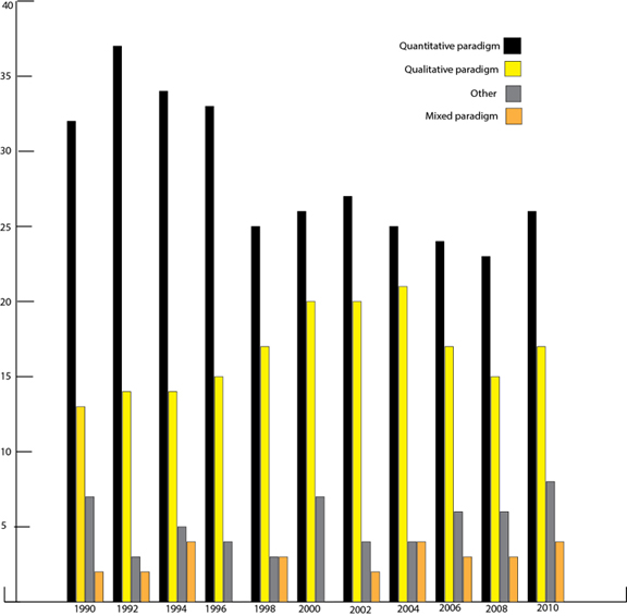
In the first phase, 609 articles were reviewed and 256 visualisations were found in the eleven conference proceedings between 1990 and 2010. I first looked at the chronological distribution of the two variables in question: the types of visualisation and the research methodologies that researchers employed in their papers. As one looks at the researchers' research methodologies, the most dominant is the quantitative paradigm, used an average of 54.5% from all manuscripts. During the late 1990s, however, a shift toward the qualitative paradigm was observed. The mixed paradigm and other methodologies also start to become more common at that point. Figure 2 shows the distribution of research paradigms found in the conference proceedings
.
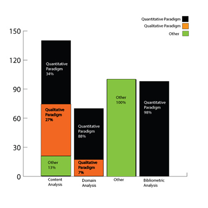
With regard to research methods, the most common methods included: content analysis, facet analysis, bibliometric analysis, domain analysis, and other analyses. The top method under the four paradigms was content analysis, with researchers using this type of method under different paradigms: quantitative (33%), qualitative (27%), and other (13%). The second most often used method was bibliometric analysis; in 87% of these instances, researchers used the quantitative paradigm. In third place was other, and in most of these cases, researchers did not define the type of analysis or the method they employed. Figure 3 summarizes the findings.
Visual analysis
The number of visualisations found in the proceedings ranged from eleven to thirty-one: the largest numbers of visual illustrations were used in 1998, 2006, and 2010, and the lowest numbers in 1990, 1994, and 1996.
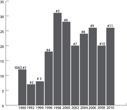
Figure 4 summarizes the findings in regards to visual displays found in the proceedings, showing that the amount of visualisation used did not correlate with the passage of time.
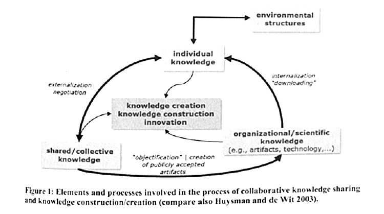
Visualisations were categorized using Lengler and Eppler's (2007) classification. Two examples were selected from the ninth conference, which took place in Vienna, Austria in 2006. Figure 5 represents the work of Peschl (2006); it displays the processes involving collaborative knowledge sharing and knowledge creation. The visualisation can be identified as a form of information visualisation, based on Lengler and Eppler's definition, and more specifically, as an entity relationship diagram.
Our second illustration also comes from the ninth conference and was created by La Barre (2006). Figure 6 represents a multifaceted classification of websites based on Alexander and Tate (1999) type and DMOZ category.
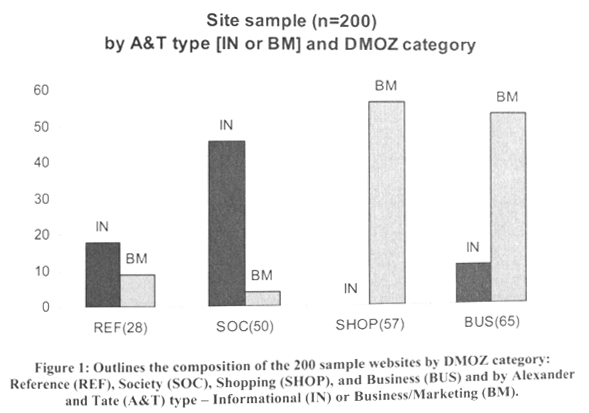
Based on Lengler and Eppler's (2007) definition, La Barre's illustration can be classified as a visual representation of quantitative data in schematic form, presenting facet distributions within each of four DMOZ classifications. Lengler and Eppler's definition of data visualisation includes different formats; in this case, the illustration best fits the description of a bar chart.
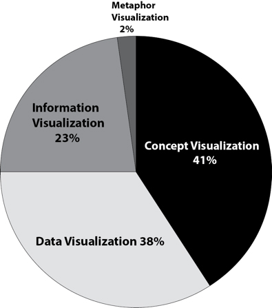
Overall, of the 256 visual displays found in 609 articles, 41% took the form of concept visualisation, while 34% were data visualisation and 23% were in the form of information visualisation. Further analysis revealed that under concept visualisation, the most common visual patterns were communication diagrams and flow charts. Under the data visualisation classification, the most common types of visualisation structure were table, bar, and line graphs. Among the information visualisation displays, the most common visualisation platforms were tree maps and entity relationships. Only 2% of all the visualisations were classified as metaphor visualisation. No visual displays appeared to fit the categories of strategy visualisation or compound visualisation. Figure 7 summarizes the findings.
I also examined the types of visual diagrams that researchers used most often, based on Lengler and Eppler's classification (2007), as discussed above. Under the concept visualisation category, the leading diagram types were evocative knowledge maps (24%), communication diagrams (21%), and concept maps (20%). Under data visualisation, the leading graphics type was a bar chart (23%), followed by pie charts (20%) and line charts (18%). In the information visualisation category, the most common type of map was a Venn diagram (18%), followed by mind maps (15%) and timelines (14%). Under metaphor visualisation, the leading map type was the knowledge map, with only seven maps classified under this category. Overall, the leading visualisation types included bar charts and knowledge maps, using Lengler and Eppler's classification.
Sample result
In order to answer RQ1: What is the relationship between research method and visual display found in presentations at ISKO conferences? a random sample of 50 visualisations was selected out of the 265 visualisation found. The sample size was determined with 92% confidence level and 10.5 confidence interval. From the sample, mean and standard deviation were computed for both research method and visualisation type.
| Research method (x) | Visualisation type (y) | |
|---|---|---|
| Sample mean | 2.33 | 0.443 |
| Sample standard deviation | 1.54 | 1.975 |
Sproull (2002) noted that correlation analysis makes no prior assumption as to whether one variable is dependent on the other. It provides an estimate of the degree of the association between the two variables; in our case, the type of visualisation and the research methodology. In fact, conducting correlation analysis makes it possible to test the independence of the two variables at hand. What appeared was a correlation of r = 0.35, p = <0.001, with R2 = 0.124. This moderate correlation indicates that visualisation type and research method do not correlate with each other.
RQ2 is: What predictions can be made about future research methods and forms of visualisation in conference proceedings in the field of knowledge organization? Predictive analysis encompasses a variety of statistical techniques from modeling, machine learning, and data mining that analyse current and historical data to make predictions about the future. The core of the research method behind this type of analysis relies on observing relationships between explanatory variables and the predicted variables from past occurrences, and using them to predict future outcomes. It is important to note, however, that the accuracy and usability of results depend greatly on the level of data analysis and the quality of assumptions. Many industries have relied heavily on forecasting models to better match their customers' future needs. The most prevalent examples of predictive models are used by credit and insurance companies that calculate credit scores for individuals. In statistics, early regression analysis has often been used to estimate the effect of one or more independent variables on a dependent variable. A different type of prediction is logit regression, which forecasts a binary response from a binary predictor. In this study, I employ this prediction model, where this logit regression model of success is measured by using a generalized linear model. The logit regression is a probabilistic statistical classification model, and it also has been used to predict a binary response, according to Menard (2002). Agresti (1996) presented the logit regression as an essential way to examine categorical data and visualisation. In this study, I employ the generalized linear model formula:
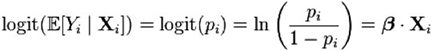
The generalized linear model allows us to predict the variables with various types of probability distributions by fitting them to a linear predictor function. This model sorts the variables arbitrarily to transform the expected value of the variable. Under the logistic generalized model, the probabilities of pi or the regression coefficients were not calculated. Open Source R was used to conduct the analysis.
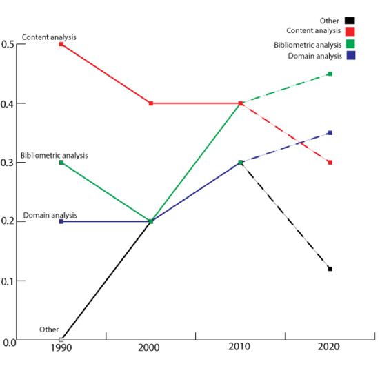
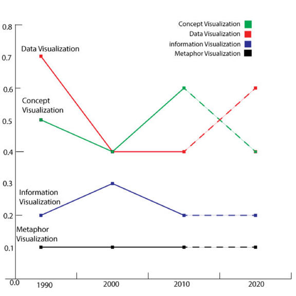
Research method and visualisation type were examined separately, given the lack of correlation between them. The initial assumption in conducting this analysis was that all factors remain unchanged. For the research method type, the initial assumption was that future researchers would continue to use content analysis as their main method. Figure 8 summarizes the analysis of past and future research methods. The value of logit was calculated for values between –1 and 1.
- Content analysis, which had been the leading method throughout the years, decreased in popularity significantly in 2010; based on predictive analysis, it will be ranked next-to-last in 2020.
- The bibliometric analysis and ‘other’ methods are predicted to continue growing.
- In the last place was domain analysis, which will continue to decline.
The solid line represents the data collected; broken lines represent the future according to the generalized linear model.
The analysis of visualisation type indicates that:
- Data visualisation will continue to grow, constituting 0.7 of the visualisations in 2020.
- Concept visualisation, on the other hand, shows a projected decline, being used for less than 0.44 of visualisations in 2020.
Figure 9 summarizes the results.
The aim in using predictive analysis was to predict the research method and visualisation types that will be used. In research method, content analysis will continue to decline while bibliometric analysis and 'other' analysis will continue to grow. Regarding visualisation platforms used, it is predicted that data visualisation in the form of charts, histograms, area charts and box plots will continue to grow in popularity in the future.
While the objective was to examine the relationship between research method and visualisation, no direct correlation could be found, due to the personalization of research method and visualisation pattern that each researcher used in his or her research. I recommend that future investigations examine the degree of personalization that researchers use in their choices of research method and visualisation patterns associated with them.
Discussion
An attempt was made to measure the intertwining roles of research methodology and visualisation types in the field of knowledge organization over time. Visualisation has become an important part of knowledge organization, according to Börner et al. (2003); however, it appeared that no study had examined the correlation between the types of visualisation researchers utilize in their research and the types of research methodologies they use. It is hoped that the analysis of the visual displays of researchers' findings will lead to a better understanding of the field and of researchers' methods and visual displays as a seminal element in the conference proceedings.
To address RQ1: What is the relationship between research method and visual display found in the conference presentations? a random sample of fifty visualisations was analysed to examine the types of research method that researchers used in their conference proceedings. Lengler and Eppler's periodic table (2007) was employed to examine the types of visualisation researchers used to report their findings. No conclusive correlation was found between the type of visual display used and the research methods employed.
I examined the entire population of visualisations found in the conference proceedings from 1990 to 2010, where I found 54.5% of the researchers examined in the study used the quantitative paradigm. A shift away from the quantitative paradigm toward qualitative, mixed, and other methodologies was detected, especially at conferences in the 2000s. The chief indicator of this shift was the finding that from 1998 to 2010, researchers used other as their main methodology, the category used when researchers did not define their paradigm. Extending the investigation to the types of research methods used, it appears that content analysis was the most used with 33% of researchers using this method under the quantitative paradigm, 27% under the qualitative paradigm, and 13% under some other paradigm. Among the last-named 13%, it appeared that researchers used content analysis without defining their paradigm or providing any explanation for their methodology.
Turning to the types of visualisation used, it appeared that 41% of all visual maps were classified as concept visualisation, which is also supported by the findings of Friedman (2007, 2010) and Friedman and Smiraglia (2013) focusing on this form of visualisation. After concept visualisation, the next most often used was data visualisation with 34%, followed by information visualisation with 23%; only 2% of the visualisations were in the metaphor category.
To address RQ2: What predictions can be made about future research methods and forms of visualisation in conference proceedings in the field of knowledge organization? Predictive analysis was applied to those platforms, producing the following prediction results:
- Data visualisation, the main platform that researchers used during the first conference proceedings, will continue to grow; our model predicts that more researchers will use this platform in 2020.
- Concept visualisation, while currently more popular than data visualisation, appears headed for a decline after years of growth; our model predicts that it will be surpassed by data visualisation by 2020.
- Information visualisation and metaphor visualisation are predicted to remain at the same level.
Further analysis of research methods using the logit predictive model produces the following predictions:
- Content analysis, once the leading method, has declined in popularity among researchers and is expected to continue its decline.
- Bibliometric analysis, on the other hand, is already even with content analysis and is expected to surpass it as the leading method by 2020.
- Domain analysis and other analyses were tied for third and fourth place in 2010, but other analyses are expected to continue growing, while a steep decline is predicted for domain analysis.
Conclusion
The chief objective of this study was to determine any relationship between research methods and the type of visualisation used. I posed the following questions:
RQ1: What is the relationship between research method and visual display used by researchers to present their findings at one of the leading international conferences in the field of knowledge organization? No direct correlation appeared; instead, it appears that many researchers personalize their research methods and their visualisation pattern to fit their needs.
RQ2: What can predictive analytics tell us about directions in research method and visual display as employed by these researchers? A logit regression model was used to determine that content analysis, the leading method at the ISKO conferences, will decline and bibliometic analysis will become the most popular method among knowledge organization researchers. Under the visualisation platforms, data visualisation in the form of table, line and line graphs will continue to increase in popularity.
The significance of this study was in the use of predictive analytics to examine the future of research method and visual display. Content analysis will decline, while bibliometic analysis will become the leading research method. Line and bar graph visual displays will continue to increase in popularity among researchers. I recommend that future investigations examine the extent to which researchers personalise their research methods and the effect of that personalisation on the kinds of visualisation they use.
About the author
Alon Friedman, PhD is an Assistant Professor at the School of Information, University of South Florida. His research interest and expertise focus on visualisation as a form of organizing knowledge, where he examines the relationship between language and visualisation grammar using Open Source R. Dr. Friedman teaches introduction and advanced Visualisation of Big Data courses at USF. He can be reached at: alonfriedman@usf.edu