The journey of information. How students perceive information in France using the draw and write technique.
Fidelia Ibekwe-SanJuan
Introduction. This study is part of an international initiative promoting an alternative arts-informed visual approach to study the conceptions of information worldwide.
Method. Participants in our study were masters’ students in the School of Journalism and Communication at Aix-Marseille University in France. 52 drawings and their corresponding textual definitions were gathered.
Analysis. A thematic analysis of the drawings was performed with the aim to identify major themes across the drawings and the texts, as well as the underlying theories evoked.
Results. The thematic analysis revealed six recurring themes that portray a journey of information, from its most basic manifestation as bits of data to its more complex and societal functions.
Conclusion. Although recurring themes appeared in the drawings made by the participants studying media and communication studies in France and the ones made by North American students enrolled in information studies in Canada (Hartel 2014), the differentia resided in the theories evoked in the drawings, which in turn reflected the ‘intellectual homes’ of the students. Our study tended to show that intellectual or academic factors outweigh cultural, linguistic or geographic ones in the students’ conceptions of information. This would indicate the importance of the domain over linguistic or geographic factors in their conceptions of information.
Introduction
This study is part of an international initiative promoting an arts-informed approach to studying the conceptions of information worldwide. Specifically, it employs the draw-and-write technique, an instance of the arts-informed visual research method and more precisely the ‘information square’ or iSquare protocol initiated by (Hartel 2014). The name ‘iSquare’ refers to the fact that the drawing is done on a small piece of square paper and that it is on the concept of information. The theoretical justification for an arts-oriented approach both in teaching and research has been summarised by (Hartel 2014). It appeared that the technique originated in the United Kingdom in the 1980s mostly in the field of education before spreading to other fields like healthcare, engineering, environmental science, geography, industrial design, and psychology. Arts-oriented approaches have been used to study a wide range of phenomena ranging from the menopause, the concept of librarian, celebrities, autism to information-seeking. Therefore, as a technique of investigation, it is not limited to any one field. It offers participants an alternative mode of expression to articulate ideas and perceptions which words alone may not capture adequately. According to (Hartel 2014, p. 1351-1353), previous authors observed that
‘Drawings offer a different kind of glimpse into human sense-making than written or spoken texts do, because they can express that which is not easily put into words: the ineffable, the elusive, the not-yet-thought-through’ (Weber and Mitchell, 1995, p. 34)’.
Prior to the iSquare initiative, investigation of the concept of information relied mainly on the traditional text-based top-down approach where the speaker rolls out different definitions that have been offered over the centuries by hundreds of authors. This often fails to connect with the target audience’s perceptions of the concept and to resonate with their realities. Our own experience of teaching information theories at graduate and post-graduate levels have shown that abstract text-based definitions tend to confuse students rather than enlighten them more so in view of the fact that some of the definitions are in outright opposition one to the other. In contrast, a bottom-up arts-informed approach allows the conceptions of information to emerge from the target audience. These conceptions can then be analysed in order to identify recurrent themes and confront them with existing theories evoked in the literature. Hence, the conceptions of information are not pushed a priori to the audience but rather emerge from the audience’s textual and artistic expressions.
Our participants were students enrolled in a masters’ degree in the School of Journalism and Communication at Aix-Marseille University in France. Data gathering occurred in a classroom setting of a course entitled “Information: a resource for the enterprise” in the autumn of 2015. In conformity with the iSquare protocol, students were given a 4” X 4” piece of white art paper and a black pen, and asked to respond to the question “What is information?” in the form of a drawing and also to complete the phrase, “Information is…” on the backside of the same paper as well as fill in demographic information (age, gender, specialty enrolled in). Our students were aged between 21-23 years old with an average of 22 years. They were given ten minutes to perform the exercise. 52 iSquares were thus collected.
As this experiment was done at the beginning of the class, students had not yet received the instructor’s lecture on the various theoretical conceptions of information. However, as the students were majoring in journalism, media and communication studies, most would have heard of well-known information and communication theories in their other classes. It is however safe to say that our students were unfamiliar with the library and information science universe and that authors like Michael Buckland, Marcia Bates, Jesse Shera, Birger Hjorland, Luciano Floridi were largely unknown to them.
The research questions we tried to answer in this study are as follows:
- What themes are perceptible in the drawings produced by the students to represent information?
- What underlying theories are evoked in these drawings?
- What does this tell us about the students’ perceptions of the nature of information?
- What bigger “story” or “narrative” about information, if any, emerges from their collective drawings?
Although these questions are formulated separately, we will treat them simultaneously in the thematic analysis section (§2 below). Hence, the rest of the paper is organised according to the major themes found in the participants’ drawings and not according to the individual questions. We also sought to determine what factors (cultural, geographic, linguistic or disciplinary) influence the way information is represented by contrasting the conceptions found in our study with those of an earlier study involving students in a north american university (Hartel 2014).
Thematic analysis of the iSquares
To identify recurrent themes in the drawings, we carried out a thematic analysis which is a qualitative analytical technique used to explore recurrent themes in a corpus of drawings. It involves a close scrutiny of the drawings to identify themes explicitly or implicitly depicted and the underlying theories to which they make reference. A summarily definition of this technique is given in the dedicated Wikipedia page: ‘Thematic analysis goes beyond simply counting phrases or words in a text and moves on to identifying implicit and explicit ideas within the data’
As a qualitative method, thematic analysis approaches the visual data inductively, but is of course informed by the analyst’s background knowledge. We drew from our knowledge of the literature on information and communications theories as well as our knowledge of the students’ background (the course they were enrolled in) to interpret their drawings. We focused mainly on the drawings on the front sides of the iSquares but also tapped into the written responses to “Information is…”. The analysis of the 52 iSquares coalesced into six major themes which, when viewed together, reveal a journey or a progression in the students’ conceptions of information. Information seems to move from its most basic form as bits of data (themes 1-3 below) to its more complex societal function, as a means for collective sense making (themes 4-6 below):
- Becoming information: information as data
- The process of informing: Shannon’s linear transmission model
- Means of informing: information encoded on material artefacts
- Information as mental states: the cognitive and individualistic viewpoint
- Being informed: the effects of the mass media on public opinion
- The circulation of information: from cybernetics to the global village
Prevalent in the six themes is Michael Buckland’s (1991) tripartite typology of information. Themes 1-3 evoke Buckland’s ‘information-as-thing’ while themes 4 and 5 call to mind Buckland’s ‘information-as-process’ and ‘information-as-knowledge’ in that they evoke the intangible nature of information as well as its social functions. The sixth theme clearly evokes mass media and communication theories where information is cast in a societal setting.
These six themes form the backdrop to the narrative about the journey of information perceived in the students’ drawings. In the sections below, we analyse in more details the features of the images that convey these themes and highlight the information theories evoked. A strict comparison with Hartel’s 204) findings on north american students’ perceptions of information is outside the scope of this paper. However, whenever relevant, we will draw attention to the presence of similar features, themes and conceptions found in both studies.
Becoming information: information as data
This theme is portrayed by drawings that focus on the most basic level of information, i.e. its physical dimension as bits of data. The iSquare in Figure 1 is an illustration of this depiction of information as “data in transport” (the French word for data ‘données’ is written on the vehicle). This drawing calls to mind the data processing paradigm inherent in Shannon’s mathematical theory of information. It is also a metaphoric allusion to the current (big) data ideology sweeping through the society where data is endowed with all sorts of hyperbolic capacities and seen as the new raw material or precious mineral (petrol, gold or a mineral) whose capture, foraging, mining and exploitation are essential to our digital economy. Only after analysis can data be turned into information and then into knowledge which in turn fuels innovation and discovery.
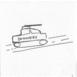
Figure 1: Information as data.
The textual definition on the reverse side of this drawing bears testimony to our interpretation. Employing a french idiomatic expression ‘Le véhicule des données, le nerf de la guerre’ (‘The vehicle of data, the nerve of the war’), the textual definition conveys the idea that data is something of strategic importance without which an endeavour will fail. Interestingly, the student used a rather old metaphor of ‘information superhighways’ rendered popular in the 1980s by the ex-Vice President of the USA, Al Gore. In the drawing, data is transported in a vehicle by road rather than transmitted by more modern technological means (satellites communications, computers, servers).
The process of informing: Shannon’s linear transmission model
The next set of drawings sets the scene for the second stage in the journey of information: after being constituted from data, information is disseminated via a source. In Figure 2, the source is represented by a transmitter in the leftmost drawing, by the word information in the middle one, and by a moonlike form in the rightmost drawing. The abstract nature of the transmitted signals (waves, arrows and lines) are reminiscent of Shannon’s mathematical theory of information. Here the focus is on the emission stage. The other stages (message encoding, channel, decoding and receiver) are not depicted.
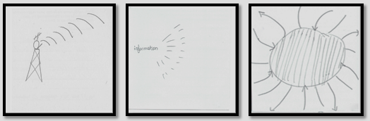
Figure 2: The process of informing: the emission stage.
The accompanying textual definitions to these iSquares bear testimony to this interpretation. The textual definitions of the iSquare with the transmitter reads ‘Information is a signal/content of any nature (text, sound, image) allowing to garner knowledge’. The middle iSquare sees information as a ‘set of details or elements that is conveyed from person to person or from person to machine or from machine to machine in an ordered or disordered manner’ while the drawing on the right casts information as ‘new things, news that are sent us’.
A second set of drawings below showcased the other stages of the Shannon-Weaver linear model of information transmission. In Figure 3, information is conveyed from various sources (technological devices, books, newspapers) to receivers which can be people or things (information repositories).
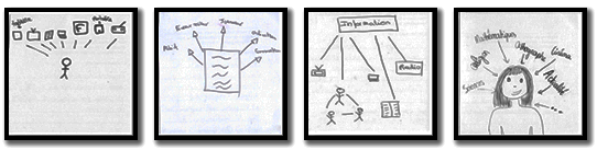
Figure 3: The process of informing: the reception stage.
The drawing in Figure 4 below tried to capture both Shannon’s linear transmission model and Wiener’s cybernetic model of information and communication. It is labelled ‘communication’.
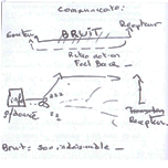
Figure 4: Shannon and Wiener’s models of information and communication combined.
Arrows and lines are used to portray the communication process: information is encoded as data (donnée) then transmitted from a sender (émetteur) to a receiver (récepteur). During transmission, the interference of noise (bruit) is represented. A dotted arrow shows how the received message engenders feedback and retroaction from the receiver to the sender. Although this process appears in two separate diagrams, the drawing as a whole refers to Wiener’s cybernetic model of information which enriched Shannon’s linear model by incorporating the feedback and retroaction loop.
Means of informing: information encoded on material artefacts
The drawings here move us a step further along the information journey. Figure 5 shows the different media on which information is recorded and made available to us — from the early print media (newspapers, books) to audiovisual media (television, radio) and lastly to digital media (Internet, computers, smartphones) with their enabling softwares (search engines and social network platforms like Twitter, Facebook, RSS). The encoding of information on material artefacts confers a degree of permanence to it, thus enabling people or machines to access it, irrespective of time and distance.

Figure 5: Means of informing: information encoded on material artefacts.
In Figure 6 below, a second set of four iSquares used grouping diagrams (drawings with multiple distinct graphic representations) to reflect this theme and to convey more precise information on:
- the type of media: human interpersonal communication are rendered by stick figures and speech bubbles; the print media by newspapers; voice media by the radio and digital media by TV, the Internet and also the specific technology or platform for delivering content (emails, RSS feeds, Google);
- the technological devices and platforms for accessing information: these are omnipresent in all the iSquares (computers, laptops, email icons, RSS, web 2.0);
- the information content obtained through these sources is rendered explicit by the words ‘Newspapers’ (journal), ‘news’, ‘press’ (presse), advertisements (petites annonces) which occurred in many of the drawings as well as names of specific French newspapers (Le Figaro, Le Monde).
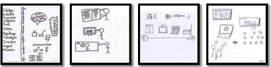
Figure 6: Means of informing (group diagrams): information encoded on material artefacts.
The leftmost drawing is striking in that it comprises a series of smaller drawings reflecting information content. The word ‘messages’ is written many times in a speech bubble, interpersonal communication and media sources on the right hand. The student aligned the words ‘sender-receiver-Shannon-transmission-exchanges’ and drew a line before writing a list of words of which the first letter is taken from the word information (Ideology-Neutrality-Fourre-tout (catch-all)-Obligatory-Rare-Mastery-Apprentissage (learning)- Technologies-Innovator-Original-Necessary).
The accompanying text on the other side of the iSquare does not really explicate the drawing but gives an insight into its author’s perception of information, seen as ‘A flow of messages, codes, news that we human beings perceive within the society. This information can be evaluated, processed, stored and appropriated in 1000 and more ways by each individual.’
The above three themes which focus on the materiality of information appear to be recurrent. (Hartel 2014) found similar themes casting ‘information as physical, objective, and contained within documents’ in the drawings done by her North American students’. Such drawings evoke the materiality of information which is the dimension in which information is best analysed, preserved and shared. This tangible dimension was best captured by Buckland (1991)’s information-as-thing and by Karl Popper’s world three in his book Objective Knowledge (1972). Popper propounded the theory of three interacting worlds through which reality can be apprehended. World one is the physical world in which we live (the universe). World two is the mental world of subjective knowledge in our heads and minds. World three is that of objective communicable knowledge which results from the recording of the mental world onto physical knowledge artefacts such as books, music, arts, documents, technologies. Popper argued that once recorded on artefacts in the objective world, human knowledge attains a degree of significance, permanence, objectivity and accessibility not given to the mental world. World three is therefore autonomous to the degree to which it is affected by worlds one and two. We have neither the place nor the time to debate this theory, suffice to say that it was espoused later by (Bertram C. Brookes 1980). In his quest for the theoretical foundations of library and information science, Brookes suggested that the objective world could proffer a theoretical justification for library and information science and constitute its ‘raison d’être’. In other words, the mission of library and information science would be to organise this world of objective knowledge such that it can be preserved for future generations. This would justify the centuries-old endeavours by pioneers like Melvil Dewey, Paul Otlet and Ranganathan to build universal classification schemes for organising knowledge worldwide and the continuing endeavours of knowledge organisation scholars to organise information stored in digital format in the Internet and web era.
The drawings in the above sections (§2.1-2.3) focused on the material and the tangible nature of information, “corporaliter, latin for ‘corporeal, pertaining to the body’. The next set of drawings move us yet another step in the journey of information towards the intangible and the cognitive internal manifestation of information ‘incorporaliter’, latin for immaterially.
Information as mental states: the cognitive and individualistic viewpoint
The four iSquares in figure 7 clearly portray information as something perceived and processed internally in the head or the brain in order to derive meaning. The presence of body parts in the drawings associated with perception and intellectual activity (brain, head, eyes, ears, hand) give credence to this interpretation.
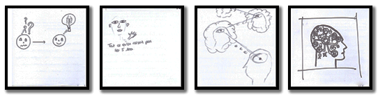
Figure 7: Information-as-mental states.
In the leftmost iSquare, a dyad in an interpersonal communication situation is depicted, one is apparently bewildered and the other comprehending. These drawings evoke Buckland’s (1991) ‘information-as-process’, i.e., the action of communicating something to someone.
The rightmost iSquare in figure 7 is a particularly striking drawing in which the brain is represented as a machine, akin to a computer mother board filled with tiny components connected to a central organ. This portrayal of the interior of the brain as a machine is cognizant of the early aspirations of the founding fathers of computer science, namely Alan Turing (1936); Norbert Wiener (1948) and John von Neumann who sought to build an artificial brain, capable of simulating and competing with human intelligence, thus leading to the invention of the computer and to the emergence of computer science and artificial intelligence.
These drawings cast information as an intangible rendered intelligible by the human mind. They therefore support the theoretical stance which restricts information to the human sphere and upholds the view that only the human mind can derive information from perceived signals. Machlup and Mansfield (1983, p. 660) observed that the dictionary definitions of information “all referred to telling something or to the something that is being told” and that “Information is addressed to human minds and is received by humans minds, though the recipient need not always be chosen by the informer or transmitter.”
(Hartel 2014) found similar anthropocentric renditions of information in her students’ drawings which focused on the intangible mental processes through which the mind and the brain process perceived signals which become information and then knowledge.
The drawings in next two sections move us away from the material (§2.1-2.3) and cognitive (§2.4) dimensions of information. They show how once detached from its physical material (corporaliter) and intangible (incorporaliter) manifestations, information operates in society. The emphasis here is on information as a social construct and as an essential ingredient for collective sense making.
Being informed: effects of the mass media on public opinion
Figure 8 portrays an interpersonal communication situation. In the leftmost drawing, two stick figures are holding copies of two French newspapers (Ouest France and Atlantique), a face at the bottom of the drawing says ‘Too much info’, thus referring to the ever-increasing phenomenon of infobesity. Using a combination of drawings and texts (speech bubbles, captions and labels), the drawing on the right depicts an everyday scenario. The caption ‘News explained to children’ (‘Les infos expliquées aux enfants’) portrays a scene where a mother (maman) and her little daughter (petite fille) try to make sense of the disturbing news ‘More wars again...’ (Encore des guerres...) on the television. The little girl is bewildered and asks ‘why’ (pourquoi), her mother only offers a sarcastic ‘because!’ (parce que !) in lieu of explanation. We witness here a mother’s inability to properly communicate and make sense of disturbing information for her little girl to understand. This highlights the fact that meaning is constructed through social interactions. In the scene portrayed, communication appears to be dysfunctional.
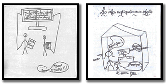
Figure 8: Being informed: the effect of the mass media on public opinion.
The accompanying textual definition on the reverse side of the right hand drawing sheds further light on the somewhat sarcastic response of the mother on the drawing side. Information is defined as:
the opposite of what is disseminated on newspapers and TV channels like TFI/France 2, information is what we go and seek for ourselves and the liberty to “know” because it is universal. Information is viral, not to be confused with rumours. In general, we are misinformed.
TF1 and France 2 are national TV channels in France. These two drawings appear to be severe indictments of the mass media seen as propaganda tools used to disinform and manipulate people rather than inform them. Hence, these drawings are reminiscent of the early mass media theories. Based on his study of political and wartime propaganda during World War II, (Harold Lasswell 1927) propounded the theory of the immediate and direct effect of the media on public opinion. This led him to propose the hypodermic syringe model of communication which considers that the media emit messages which the public ingest and this causes it to react in a particular way. Lasswell himself was influenced by behaviourism and by Ivan Pavlov’s work on conditioned reflexes in psychology. Lasswell’s famous 5W formula ‘Who Says What. In Which Channel. To Whom. With What Effect? ’ was formulated in 1948, at the same as Shannon’s Mathematical Theory of Communication. As the communication counterpart to Shannon’s theory, Lasswell’s linear communication model is still omnipresent in mass communication and media studies as well as in communication agencies. In studying how people voted during a US presidential election, (Paul Lazarsfeld 1944) showed that although the mass media influenced public opinion, this influence is neither immediate nor as direct as Lasswell seemed to think. People’s opinions were more likely to be influenced through interpersonal communications, peer groups and opinion leaders. This led Lazarsfeld to postulate the “two-step-flow of communication” theory which nuanced Lasswell’s immediate and direct effect theory of the mass media on public opinion.
Later, (McCombs and Shaw 1972) further enhanced Lasswell and Lazarsfeld’s theories with the media agenda setting theory. This theory was aptly summarised by the political scientist B.C Cohen’s statement of 1963 that “the press may not always succeed in telling people ‘what to think’ all the time but they are very successful in telling them ‘what to think about’ (http://en.wikipedia.org/wiki/Agenda-setting_theory), thus, somewhat reasserting the role of the mass media as the public agenda setters.
It is however surprising that even today in our 21st century rife with multiple channels of information and communication some of which involve two-conversation channels (social media), our students remain convinced about the power of the mass media to shape public opinion. This is somewhat at odds with the much-celebrated horizontal and participatory communication practices ushered in by web 2.0. What makes the tenacity of this belief all the more surprising is that the students who made the drawings are young adults (22 years of average) and are part of what is termed ‘the Y generation’, i.e. early adopters information and communication technologies and of two-way communication media (Facebook, Twitter, Instagram, Snapchat, etc). It would appear then that their own information and communication practices are at odds with their deep-rooted convictions about the power of the mass media’s unidirectional model to influence public opinion.
Figure 9 takes this idea further by raising the question of the truth value of information. Three stick figures with speech bubbles at their sides are featured, each holding two spiral lines with letters or numbers in them. Bewildered by this abstract representation of information, we consulted the textual definition on the other side of the drawing which read ‘Information is noise: nowadays everything is distorted to buzz more than your neighbour. Information is what enables us to retain what suits us in order to defend our ideas.’ The idea that information is at best noise and at worse propaganda echoes the same ideas of manipulation but here by forces unnamed.
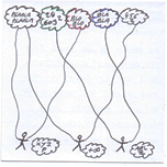
Figure 9: Being informed: Information-as-propaganda.
By questioning the truth-value of information, this drawing and its accompanying textual definition challenge the analytical philosophical viewpoint that requires information to have truth value in order to qualify as such (Dretske 1981, Floridi 2005).
Free circulation of information: from cybernetics to the global village
Drawings in this sixth theme portray information as something which connects people. Using a number of artistic devices (networks, circles), the drawings in figure 10 convey the impression of network, of movement and of interaction.
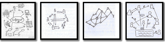
Figure 10: Information networks: The free circulation of information.
Of noteworthy interest is the textual definition of the leftmost iSquare which also explicitly evokes the cybernetic ideal. It asserts that the goal of information is:
To inform the citizen of current affairs of every type (economy, social, sports, enterprises) via different media. Information should, in an ideal world, be free and well researched so as to better account for its reception.
The evocation of an ideal world where information circulates freely is a clear reference to Norbert Wiener’s (1948) cybernetic theory. For Wiener, information and communication are the basic components that structure our society. Hence, their free circulation is a safeguard against the return to entropy, seen by Wiener as a malevolent force to be avoided at all costs because it led to the Nazi regime, to fascism and to the chaos of the two world wars.
A second set of drawings in this theme (Figure 11) employs the figure of the circle to convey both Wiener’s ideal of free circulation of information and Marshall McLuhan’s 1962 prophecy that the next technological innovation will make the world a global village. The invention of the Internet effectively abolished time and distance constraints and enabled instant transmission of information from one point of the globe to another.
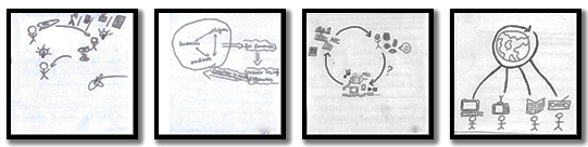
Figure 11: The free circulation of information: McLuhan’s global village.
These drawings convey a belief in the good of information and communication technologies. In his book From Counterculture to Cyberculture, (Fred Turner 2006) recounted how the rise of digital utopianism was a result of an alliance between two seemingly contradictory ideologies: the ultraliberal ideology on the one hand and the libertarian ideology on the other. The latter imbued the countercultural movement of the 1970s in San Francisco where its members founded communities in rural areas, far from America’s urban capitals and embraced technology as a means of personal emancipation. The belief that technology is a tool for individual emancipation thus sealed the alliance between the libertarian ideology which underpinned the countercultural movement and the ultraliberal ideology which underpinned the information technology community surrounding the MIT research labs and Silicon Valley. One of the influential figures of the countercultural movement, Stewart Brand founded the Whole Earth Catalog (https://en.wikipedia.org/wiki/Whole_Earth_Catalog) in 1968, a cross between a catalog, a recommender system and a discussion forum which foreshadowed what subsequently became the web: this global online platform linking virtual communities worldwide. Brand was an admirer of Norbert Wiener. Silicon Valley tech giants like Google, Amazon, Facebook, Apple (GAFA) are convinced that their technologies will change the world for the better (See for instance the New Yorker Magazine 2013, Change the world. http://www.newyorker.com/magazine/2013/05/27/change-the-world). This form of technological determinism inherent in the cybernetic ideal has come under much criticism from many analysts (Evgeny Morozov 2013).
Discussion and perspectives
The use of an arts-informed approach in a classroom setting represents an innovative bottom-up pedagogical approach to studying the nature of abstract concepts. Using both text and drawing, students were able to articulate the complex nature of information through its manifestations in private, professional and social contexts. Remarkably, some well-known information and communication theories recurred in several drawings. Shannon’s linear transmission model, Wiener’s circular cybernetic model, Gregory Bateson and the Palo Alto school’s interpersonal communication model which was inspired by cybernetics, Harold Lasswell and Lazarsfeld’s mass communication theories were among the recurring theoretical frameworks underpinning the drawings. This reaffirms the trans-disciplinary nature of these theories which cross disciplinary, cultural, linguistic and geographic frontiers.
Not only did the six themes we identified nicely capture the different manifestations of information, but they portrayed its increasing level of complexity, showing that our “young” participants perceived the multidimensional and ambiguous nature of this central concept. In its simplest basic form, information is made up bits of data (§2.1 Becoming information). The bits are encoded then transmitted across distance or time using telecommunications technology thanks to Shannon’s mathematical model for data encryption and transmission (§2.2. The process of informing). Upon reception, the bits are reassembled and materialised in an intelligible form on physical artefacts such as books, newspapers, audio-visual documents, and screens (§2.3. Means of informing). These intelligible forms are perceived by individual human minds to forge meaning and become knowledge (§2.4. Information-as-mental-states). From individual perception, information remerges into the physical world where meaning is constructed socially, through interpersonal and group communication and through the mass media (§2.5. Being informed).
At the societal level, the free circulation of information and communication through technology is considered essential by Norbert Wiener to guard our society against the return to dictatorship and to chaos (§2.6. The circulation of information). This has given rise to the current digital utopianism sweeping through our society. The open source and open access movements defended by many activists and scholars seem paradoxically to be favouring big ultraliberal corporations. Indeed, big private companies like the GAFA are in a favourable position to turn the massive amounts of information available freely into competitive advantage while at the same time padlocking their own information treasures behind proprietary silos and monetising the resulting information services.
Concerning the relation between the drawings and the textual definitions, earlier studies reviewed by (Hartel 2014) showed that researchers using this technique in other fields considered that ‘the written portion of the exercise is crucial to understand the meaning of the drawing (Briell et al., 2010)’. However, in line with Hartel’s own findings, we also found that drawings and their corresponding textual definitions of information do not always reinforce one another. In other words, the drawing can seem to be saying one thing while the text is saying something else, or the drawing can be belied by the text and vice versa. It would therefore seem that participants do not express the same things via these two modes of expression. This can be due to several reasons of which we put forward two. Participants who are more at ease with graphic representation tend to deliver more detailed and explicit drawings that are accompanied with somewhat cryptic and understated textual definitions. On the contrary, participants who are more articulate verbally tend to provide more detailed textual definitions to which their sketchy rudimentary drawings do not do full justice. These preliminary observations call for a fuller investigation, preferably in a comparative international setting.
Finally, it must be observed that the draw-and-write approach is not without limitations. Some participants may be refractory to the artistic mode of expression and hence be inhibited by it. Others may seek to please the instructor in their artistic rendition rather than trying to depict their own perceptions as faithfully as possible. However, this second limitation is applicable to any qualitative methodology. Interviews, surveys and focus groups are well-known techniques used in many fields to study all kinds of phenomena. When querying human subjects, one can never be absolutely certain that the answers given by the participants correspond to what they really think or do. It may be that participants are simply saying what they think the interviewer wants to hear. They can also experience difficulty verbalising their thoughts and actions. More likely, the way the questions are phrased and the interviews conducted can orient interviewees towards certain answers rather than others. These are inherent limitations linked to qualitative methods and there is no theoretical way to eliminate these biases.
The strongest criticism that can be levelled at this type of study is what can be called the “interpreter-effect”. Indeed, the analysis and interpretation of the visual data and to some extent, the textual definitions remain a subjective endeavour. To the best of our knowledge, there are no hard and fast rules guiding the interpretation of a drawing.
This subjectivity leads to a corollary: thematic analysis draws heavily on the interpreter’s perceptions which are in turn necessarily influenced by his/her intellectual, cultural and sociolinguistic baggage. Our interpretation of the drawings were influenced on the one hand by our background knowledge of prominent information and communication theories (Ibekwe-SanJuan and Dousa, 2013), and on the other by our knowledge of the experimental context. Our participants were masters’ students majoring in communication and media studies. This explains, in our view, the prevalence of mass media and communications theories, rather than library and information science theories as was the case in (Hartel 2014). Although, Buckland’s 1991 tripartite characterisation of information can be perceived across many drawings, the terminology used by our students and the themes recurrent in their drawings stem more from mass media and communication theories.
It should be noted that the interpreter bias is inherent to all qualitative methods reliant on human analysis. During the 1970s, when the fields of library science and information retrieval were faced with automation, a long and lively debate ensued around what was termed the “indexer-effect”. This led to the Cranfield experiments that saw the installation of automatic indexing methods over manual indexing (Cleverdon 1960) and subsequently led to the development of Internet search engines.
However, the indexer or interpreter effect can be reduced in two ways. First, by accumulating evidence from several scores of drawings, one begins to see recurrent patterns emerge. So while the interpretation remains subjective, its aggregation over a significant number of drawings and text serve to reduce arbitrariness and to confirm certain perceptions and hypotheses. Some of the features and theories perceived in our drawings were also present in the drawings of information by students in north America.
Another means of reducing the “interpreter effect” could be to adopt a more inductive approach in the future by asking the participants themselves to verbalise what their drawings mean and then confront their explanation to theories of information propounded in the literature. While this will not entirely eliminate the subjective element — the confrontation with the theoretical literature will in itself involve a certain degree of subjectivity, we believe it will reduce the interpreter effect to some degree.
Finally, although we found similar themes in the drawings made by french students enrolled in media and communication studies and those produced by north american students enrolled in information studies in Canada, the differentia resided in the theories evoked which in turn reflected the “intellectual homes” of the students. By “intellectual home”, we mean the academic discipline from which the students hail and the theories with which they had been nourished. It would appear that intellectual or academic factor outweighs cultural, linguistic or geographic ones in the students’ conceptions of information. If confirmed, this will point to the predominance of the domain over other factors. This hypothesis needs further investigation. An international iSquare group (http://www.isquares.info/international-isquare-study.html) comprising researchers from twelve countries may shed more light on this by carrying out a wider cross-cultural and geographic analysis of drawings made by students from other parts of the world.
About the author
Fidelia Ibekwe-SanJuan is a Professor at the School of Journalism and Communication, University of Aix-Marseille in France. Her research spans both theoretical and applied issues. She first developed methodologies and tools for text mining and information retrieval. More recently, her research has focused on the fundamental implications of recent trends linked to ICTs such as big data, open data and Web 2.0 on science and on the society. She is also interested in the epistemology of science, in (inter)- disciplinarity issues and in the history of information and library science. She can be reached at fidelia.ibekwe-sanjuan@univ-amu.fr
References
- Brookes, B. C., (1980). The foundations of information science: part I. Philosophical aspects. Journal of Information Science, 2(3), 125-133.
- Buckland, M. (1991). Information as thing. Journal of the American Society for Information Science & Technology, 42(5), 351-360.
- Cleverdon, C. W., (1960). ASLIB Cranfield research project on the comparative efficiency of indexing systems. ASLIB Proceedings, XII, 421-431.
- Dretske F.I., (1981). Knowledge and the Flow of Information. Oxford: Blackwell. Reprinted, Stanford, CA: CSLI Publications, 1999.
- Floridi, L. (2005). Is Information Meaningful Data? Philosophy and Phenomenological Research, 70(2), 351-370.
- Floridi L. (2005). Semantic Conceptions of Information, The Stanford Encyclopedia of Philosophy, Edward N. Zalta (ed.), Accessible online at http://plato.stanford.edu/archives/spr2011/entries/information-semantic/.
- Hartel, J. (2014). An Arts-informed study of information using the draw-and-write technique. Journal of the American Society for Information Science and Technology, 65(7), 1349-1367.
- Ibekwe-SanJuan, F. & Dousa, T. (Eds.) (2013). Theories of Information, Communication and Knowledge. Dordrecht, NL: Springer-Verlag. Series ‘Studies in History and Philosophy of Science’, Volume 34.
- Ibekwe-SanJuan, F. (2012). La science de l'information. Origines, théories et paradigmes, Paris, France: Hermès-Lavoisier.
- Lasswell, H. & Bryson, L. (Ed). (1948). The Structure and Function of Communication in Society. The Communication of Ideas. New York: Institute for Religious and Social Studies 117.
- Lasswell, H. (1927). Propaganda Technique in the World War, New York, NY: Peter Smith.
- Lazarsfeld, P. Berelson, B. & Gaudet, H. (1944). The people's choice: how the voter makes up his mind in a presidential campaign. Columbia: Columbia University Press.
- Machlup, F. & Mansfield, U. (Eds.) (1983). The Study of information: Interdisciplinary messages. New York, NY: Wiley.
- McCombs, M., Shaw, D. (1972). The agenda-setting function of mass media. Public Opinion Quarterly, 36(2).
- McLuhan, M. (1962). The Gutenberg Galaxy. Toronto: University of Toronto Press.
- Morozov, E. (2013). To Save Everthing, Click here: The Folly of Technological Solutionism. US: PublicAffairs.
- Popper, K. (1972). Objective Knowledge. An evolutionary approach. Oxford: Oxford University Press.
- Turing, A. (1936). On computable numbers with an application to the Entscheidungsproblem, Proceedings of the London Mathematical Society, Series 2(42), 230–265.
- Turner, F. (2006). From Counterculture to Cyberculture. Stewart Brant, The whole earth network, And the rise of the digital utopianism. Chicago, IL: The University of Chicago Press.
- Wiener, N. (1948), Cybernetics: Or Control and Communication in the Animal and the Machine. Hermann & Cie & Cambridge, MA: MIT Press.