Mapping science: tools for bibliometric and altmetric studies
Veslava Osinska, and Radoslaw Klimas
Introduction. The study investigates whether online attention, carried out on social media or by video tutorials, affects the popularity of these tools in the research community.
Method. We collected data from the Web of Science, Scopus, YouTube, Facebook, Twitter, and Instagram, using web-scraping tools. Bibliometrics, altmetrics and webometrics were applied to process the data and to analyse Gephi, Sci2 Tool, VOSviewer, Pajek, CiteSpace and HistCite.
Analysis. Statistical and network analyses, and YouTube analytics, were used. The tools’ interfaces were assessed in the preliminary stage of the comparison. The results were plotted on charts and graphs, and compared.
Results. Social media and video tutorials had minimal influence on the popularity of different tools, as reflected by the number of papers within the Web of Science and Scopus where they featured. However, the small but constant growth of publications mentioning Gephi could be a result of Twitter promotion and a high number of video tutorials. The authors proposed four directions for further comparisons of science mapping software.
Conclusions. This work shows that biblio- and scientometricians are not influenced by social media visibility or accessibility of video tutorials. Future research on this topic could focus on evaluating the tools, their features and usability, or the availability of workshops.
DOI: https://doi.org/10.47989/irpaper909
Introduction
Science mapping or science visualisation is a quickly developing practice among researchers. It is used not only in widely defined information science from which it sprung, but also in other disciplines. Recent studies report that in the last few years, science mapping has gained more attention in scientific fields beyond information science (He, et al., 2019). The increasing popularity of science mapping creates a demand for new specialised software. Understood as a ‘generic process of domain analysis and visualisation’ (Chen, 2017a), this field of study should provide insight into the visual distribution of scientific data, as well as the groundwork for arguments. Science mapping software facilitates analysis, statistical measures and spectacular visual layouts, illuminating the specificity and nature of scientific knowledge. It can be expected that specialised software will be useful to researchers regardless of their disciplines, experience and seniority.
Bibliometric studies require varied and constantly developing tools for science mapping. We may wonder what the reasons are behind the researchers’ choice of tools. The international accessibility of tools also raises questions regarding the distribution of users according to nationality, and the impact of the language used in video tutorials. A study of science mapping should examine the teaching materials related to selected tools. It should also consider the contribution of software designers and users to the promotion of a specific tool.
Thanks to the growth of the Internet and social media, scholars may easily share their work and track the publications of their colleagues, as well as lead discussions, disseminate their own specific knowledge and propagate the results of their research (Levin, et al., 2016). Open Science involves not only sharing research findings and data but also the tools created and the codes of programs written to accomplish specific tasks. Therefore, the visibility of a given tool and the opinions shared online may decide about the tool’s further popularity and its position in the research community. This is also determined by the tool’s usability. Thus, the availability and quality of relevant online tutorials are also significant.
Nowadays, it is more convenient to watch a video tutorial, which allows the viewer to quickly examine the presented tool, than to read a massive manual, available as a large PDF file. To better understand this phenomenon, many scholars study the patterns of tool usage, and the effectiveness of interactive videos and illustrated textbooks (Merkt, et al., 2011). Attractive video tutorials not only help a researcher to make a decision, but also educate them on the often complex functions of a given tool. High-quality free tutorials allow the software designers to find a larger audience, popularising the tool among less experienced users. A thoughtful positioning strategy can make a significant contribution to the tool’s success. Studies show that the number of videos on a given topic correlates with its popularity and future potential (Munaro, et al., 2020).
The authors of this article define users’ activity on social media in terms of interactions with video tutorials, and analyse it with the use of altmetrics. This article aims to compare certain tools in terms of bibliometrics and altmetrics. Additionally, it examines the relationship between the online visibility of a given tool (representation in social media and the accessibility of tutorials) and usage (reflected by the number of publications mentioning the tool).
Social media and websites can be used to promote the tool and to communicate with the users. The authors hypothesise that social media activity and accessibility of video tutorials may increase the tool’s popularity and usage, reflected in scientific publications. The authors described analysing the tutorials’ space as tutmetrics. The bibliographic data collected from the Web of Science and Scopus, as well as YouTube, Facebook, Twitter, and Instagram statistics, were used to test this hypothesis for the most significant scientometric tools of the last decade, such as Gephi (Bastian et al., 2009), VOSviewer or Pajek. This is the first study of the effect of online attention on usage.
Science mapping terms and tools in related studies
The science of science studies in the scientometric approach draws not only on quantitative research, but also on the qualitative analyses of scientific landscapes (Chen, 2004). Science mapping may depict fields of research focused on specific issues, or relations between scientific groups or individuals. This practice appears under different names. The most popular is science maps, which focuses on the end result, with science mapping as a synonym, encompassing the entire process of data acquisition, analysis, and visualisation, including all the stages of data processing. Scholars agree that the aim of science mapping is to analyse a domain of scientific knowledge that is reflected in an aggregated collection of intellectual contributions from members of a scientific community, or more precisely defined specialities (Chen, 2017a). Chen (2004) has coined a placeholder term for science mapping, knowledge-domain visualisation. Scholars of knowledge organization studies also refer to this practice as domain analysis (Smiraglia, 2015).
The most prominent bibliometrician, who introduced the idea of a citation index for science measuring, Eugene Garfield, was one of the first who explored the visual representations of scientific research (Garfield, 1955; 1964). In his revolutionary work, he analysed citation data to write the history of science. He traced the discovery of DNA following the publication of Isaac Asimov’s book The genetic code, and analysed the citation linkages among forty related works. His paper presented the development of the concept of the DNA structure on a chronological chart. The chart showed that a reference system does not have to be a one-dimensional linear diagram; instead, it might be coded on a plane with more than three variables: time (sequence), domain category (square corner), Asimov’s network metrics (colour) and cited name (hub) (Allgood, et al., 2007). The practice of mapping the connections between key papers allowing for a reconstruction of the intellectual history of a significant discovery was called historiography (Garfield, 1964). The practice was further applied and developed by the designers of the HistCite application (which can be downloaded from this website, to be used at different stages of scientometric analysis).
Most of the later scientometric studies established relations between different papers by co-citation analysis, which used statistical techniques such as factor analysis, multi-dimensional scaling, cluster analysis and Kohonen networks (Osinska and Bala, 2015; van Eck and Waltman, 2010; Muñoz-Muñoz and Mirón-Valdivieso, 2017; White, 1998). In his work on citation patterns, Garfield (1994) also coined terms referring to visual scientometrics such as scientography and scientographs . Despite the fact that the term ‘scientography’ is the most appropriate description of ‘graphing of science,’ it is not widely used.
Gradually, the amount of bibliographic data analysed in a single article increased. Co-citations, co-words and co-authors have been treated as nodes and links in constructing network visualisations. Next, network science, open-data initiatives and network analysis software were developed in response to the interest in science mapping; an interdisciplinary research field emerged on the borders of scientometrics, graph theory and information visualisation.
Börner and colleagues founded the Web service Places and Spaces to popularise science mapping and promote maps with the widest influence (Allgood, et al., 2007). She described the practice of science mapping in her Atlas of science ( Börner, 2010). The readers were introduced to the issues in science mapping, as well as to basic scientometric laws, paradigms, and scientometrics’ relation with scientific disciplines. Börner presented the significant developments in science mapping on a timeline, starting with the late 1950s. Until the 1970s, visualisations of relationships between publications and their authors were made manually or semi-manually, with drafting tools and millimetre paper. It should be mentioned here that basic skills such as graph construction were a required element of high school education.
The timeline presented several layers of milestone events in the history of science mapping (Börner, 2010, p.26-47). Börner identified these layers as algorithms, visualisations, tools, and books. The first layer allows the viewers to track the history of emerging algorithms and techniques that facilitated the reduction of input data and their presentation. Examples such as the Kamada-Kawai algorithm, pathfinder network scaling, latent semantic analysis, and self-organizing maps constitute one of the historical sequences, known today as the basis for graphic layouts (Chen, 2004). The timeline also shows key publications which established the main directions in science mapping. We see the importance of visualisation when we refer to the tools which implemented these algorithms. The majority of software is open-source and free because it was produced at research labs for non-commercial use. The names of tools we use nowadays appeared in scholarship in the second half of the 1990s. Pajek, the first free software for network analysis and visualisation, was designed in 1996 at Ljubljana University in Slovenia; it is one of the tools considered in this study.
Since 2000, the timeline has extended significantly because a wide variety of mapping software was introduced. These new programs are designed for the analysis of large and complex networks: UCINET, TouchGraph (both currently paid applications), visone, and SoNIA. Other programs are oriented towards dynamics analysis (DyNet, NetVis, and CiteSpace) and changes in time (HistCite), or geospatial and temporal analysis (Geotime). A variety of tools allows for the analysis of research trends, using bibliography and other document data for a given period. Thanks to the development of graph modelling, some researchers call this practice bibliographic netography (Börner, 2010; van Eck and Waltman, 2010). The wide applicability of the generation of software specialising in social network analysis can be observed, such as Facebook friend groups.
The evolution of visualisation interfaces followed the development of information and communications technologies as well as application software. Since the era of personal computers which began in the 1970s, computer-made maps have been appearing in scientific publications. The first interactive visual maps emerged in the 1980s. Since the 1990s, 3D graphics have been increasingly popular with the users; followed by 3D visualisation projects (for example, IN-SPIRE in 1994) entering academic writing (Börner, 2010).
Science mapping and visualisation depend on the accessibility of tools and the users’ proficiency, as well as their familiarity with bibliographic databases, statistics and visualisation techniques, which together determine whether the analysis will be successful. Therefore, a consistent characterisation of all mapping software would be desirable. Young researchers are often unfamiliar with specific scientometric practices and their history. Since 2011, library and information science scholars have been conducting comparative studies of science mapping and visualisation tools (Börner, et al., 2010; Cobo, et al., 2011; Pradhan, 2017; Bankar and Lihitkar, 2019). Mingers and Leydesdorff (2015) relied on those findings in constructing their own scientometric framework. Chen (2004, 2017b, 2017a), the designer of the popular CiteSpace application and an interface expert, has reviewed science-mapping scholarship and software in a number of books and papers.
Authors of previous studies on science mapping selected various tools, considered to be representative. Thus, the earliest list of science mapping software includes the most widely used programs (Börner, 2010; Cobe, 2011): BibExcel, CiteSpace, In-SPIRE, and others. The longest and most complete set lists twenty software applications, including the R Bibliometrix package for scientists with programming skills (Pradhan, 2017). In contrast, Chen’s (2017b) study focused on only three applications: his own CiteSpace, VOSviewer and CitNetExplorer. Developers presented CitNetExplorer as an extension module of VOSviewer (van Eck and Waltman, 2014), and therefore, this article treats them as one unit. These last two programs, designed by van Eck and Waltman, are particularly significant for bibliometrics today.
The definitive list of science mapping software was composed based on the following criteria:
- A common part of listed toolsets in published research.
- The software was free to use.
- The software was easy to use for most researchers.
- The software’s features met the needs of scientometrics, as evidenced by tutorials at leading scientometric conferences and schools in the period 2010–2018 (International Society for Scientometrics and Informetrics, Science, Technology and Innovation Indicators Conference, European Summer School for Scientometrics).
- There was an association with significant events and figures.
Therefore, the final set included seven programs, listed in chronological order: Pajek (1996), CiteSpace (1999), HistCite (2004), Gephi (2006), Sci2 Tool (2009), VOSviewer (2010) and CitNetExplorer (2017). It is worth mentioning that the selected tools are equipped with bibliographic data-processing modules, required of specialised software today, which should perform many tasks. What makes the selected list different from those used in previous works is the exclusion of BibExcel, an older generation (created on the DOS operating system but updated on the Windows platform) portable program for the advanced processing of multivariate data derived from global databases such as the Web of Science and Scopus.
Methods
The rapid growth of information and communication technologies means that programs quickly become outdated. Academic software evolves to match the needs of the scientific community. This justifies the authors’ decision to repeat a comparative study of the specialised software.
This article introduces a new hybrid method. It is believed that combining the following four different approaches will allow for a more precise evaluation of the considered software:
- Literature review to trace the usage of a given tool. The usage can be determined by the number of publications featuring the tool and their citation patterns, analysed with the use of bibliometrics.
- Analysis of the accessibility and viewership of the tutorials published on social media, particularly on YouTube. This is a novel approach in the evaluation of specified software/method popularity, as online teaching is a relatively recent phenomenon.
- Analysis of the tools’ online visibility and their promotion on various social media platforms. The public’s interest in a given program can be quantified by current users’ online activity, analysed with the use of altmerics.
- A comparison of features and functionalities. The tools are designed for different purposes and as such, they perform different functions.
Bibliometric analysis
The Web of Science and Scopus databases contain data regarding papers, which reflect the usage of science mapping and visualisation tools. It was assumed that the particular software used for the bibliometric research would be mentioned not only in the metadata, such as title, abstract, or keywords, but will also leave a footprint in the references. Indeed, the researchers might mention the tool in the full text of the paper, for example, in the section on the methodology, or in the captions under figures. Because the databases do not provide access to the full text of the publication dataset, the research was limited to metadata as well as references contents. The aim was to find all papers mentioning the tools listed above, and then to conduct a network analysis and topic analysis of the found data. This would show which programs were more popular and used more often in research.
Video tutorial statistics
The video statistics of software tutorials (official and unofficial) can be sources of valuable information. In order to analyse these, a table of 404 YouTube video tutorials was prepared, with the columns as follows:
- Program name.
- The name of the video.
- Year of uploading.
- YouTube link.
- View count.
- Language.
YouTube was selected because of its popularity and accessibility. The videos were selected manually, with the names of the tools used as a search term. The relevant items were compiled into a playlist, which was then converted into a table by a YouTube playlist scraper. The tool converted the YouTube playlist into a table containing the first four data elements listed above (from a to d). View counts (as of 29 April 2020) were retrieved manually, as was the information regarding language, which was determined from the title or/and the content of the video.
Altmetric analysis
Altmetrics is an alternative form of measuring academic reputation, which accounts for online research outputs, such as social media, online news media, or online reference managers (Priem, et al., 2011; Mcfedries, 2012). Previous research results (Maricato, et al., 2018) indicate that the impact measured using altmetrics gives an accurate image of scientific relationships, like bibliometrics or scientometrics.
Other studies (Ryan, et al., 2016, Ryan, et al., 2019) show that information practices of academics are often replicated in informal online environments such as social media. Because of this, Facebook, Twitter and Instagram were carefully examined for user frequencies. The goal was to determine if the developers of a given tool promoted it and how often were the relevant posts published. This kind of self-promotion is a significant activity that ensures communication between users and developers, and shows the developer’s involvement in the tool’s development and perception.
Additionally, official web pages were examined to define the promoted image of the tools. All online activity affects a tool’s popularity and influences the public’s perception of it. The number of posts was found manually for Facebook, or by Foller.me also for Twitter. Foller.me is a free tool for the automatic measurement of selected social pages, focusing on specific statistics, such as the number of posts.
Comparison of features
Basic information about the abovementioned tools is shown in Table 1.
| Name | Year | Author/s | Associated institution | Webpage | Operating system |
|---|---|---|---|---|---|
| VOSviewer | 2010 | Nees Jan van Eck, Ludo Waltman | Leiden University (The Netherlands) | www.vosviewer.com | MS Windows, Mac OS X, other |
| CitNetExplorer | 2017 | as above | as above | www.citnetexplorer.nl | as above |
| CiteSpace | 1999 | Chaomei Chen | Drexel University (USA) | cluster.ischool.drexel.edu/~cchen/citespace/ | MS Windows, Mac OS X |
| Science of Science (Sci2 Tool ) | 2009 | Cyberinfrastructure for Network Science Centre | Indiana University (USA) | Sci2.cns.iu.edu | MS Windows, Mac OS X |
| Gephi | 2006 | Mathieu Bastian, Mathieu Jacomy, and community | none | gephi.org/ | MS Windows, Mac OS X, Linux |
| Pajek | 1996 | Vladimir Batagejl, Andrej Mrvar | University of Ljubljana (Slovenia) | vlado.fmf.uni-lj.si/pub/networks/pajek | MS Windows, Mac OS X, Linux |
| HistCite | 2004 | Eugene Garfield | none | histcite.software.informer.com | MS Windows |
The two tools: Sci2 and Histcite were not updated within the last year, which may indicate that the developers have ceased working on them. Information about the operating system that the software runs on was taken from the manual or instructions. Visual scientometric tools had different timespans, and likely the numbers of users they attracted changed over time. Many users could have switched to other tools, which offered features better suited to their needs. Science mapping is a complex process that consists of several phases, such as: 1) data gathering, 2) data processing (namely preparing to the required format), 3) mapping into the output space using selected clustering or aggregation algorithms (visualisation), 4) data analysis and modelling through a changing visualisation layout, filtering and so on, 5) graphic design like manipulating visual variables (size, colour, shape, patterns), and 6) the validation and interpretation of a given pattern (Börner, et al., 2003; Osinska and Malak, 2014). It should not be surprising that tool designers are trying to provide all these tasks in one application and the integration of multifunctions can be observed within contemporary software. However, some differences in the scope of functionality between the above-mentioned tools are detected and presented in the following table.
| Name | Main data functions | Input data formats/sources | Output data formats | Visual layouts | Documentation |
|---|---|---|---|---|---|
| VOSViewer CitNetExplorer | processing, visualisation, analysis, reporting | CSV, TXT, GML, NET, MAT, CLU, VEC, RIS, ENW, WoS plaintext, Scopus, PubMed, Dimensions, RefWorks, Microsoft Academic, EuropePMC, Semantic Scholar, OCC, COCI, Wikidata | CSV, TXT, GML, NET, CLU, VEC, PNG, SVG, JPG, PDF | 3 | attached free ebook, linked free video tutorial |
| CiteSpace | gathering, processing, visualisation, analysis, graphic design reporting (also in the form of movie ) | CSV, XML, PDF, TXT, WoS plaintext, Scopus, PubMed, CrossRef, Dimensions, ADS, arXiv, CNKI, CCSSI, Derwent, NSF, Proquest | NET, TSV, PNG, VIZ, LAYOUT, HTML, CSV, PAJ, LIST, GraphML | 6 | linked paid ebook, link to unavailable file of manual |
| Science of Science (Sci2 Tool) | gathering, processing, visualisation, analysis, reporting | GraphML, XML, NET, NWB, WoS plaintext, BIB, ENW, Scopus, NSF, MAT, EDGE, CSV | XML, GraphML, MAT, NET, NWB, JPG, PDF, PS | 19 | linked free ebooks and linked free online manual |
| Gephi | visualisation, filtering, analysis, graphic design, reporting (also in the form of movie) | CSV, TSV, EDGES, XLS, XLSX, GraphML, GEXF, GDF, NET, DL, DOT, TPL, VNA, GV, TGF, GEPHI | SVG, PDF, PNG, CSV, TSV, EDGES, GraphML, GEXF, GDF, NET, DL, VNA, GEPHI | 12 | linked free online manual, linked free video tutorials |
| Pajek | processing, visualisation, analysis, graphic design, reporting (also in the form of movie). | NET, MAT, VGR, GED, DAT, BS, MAC, MOL, CLU, VEC, PER, CLS, HIE | EPS, PS, SVG, JPEG, BMP, VOSViewer, X3D, Kinemages, VRML, MOL, R, SPSS, TXT, XLS, GEDCOM | 9 | attached ebook |
| HistCite | processing, analysis, visualisation reporting. | WoS plaintext,TXT, HCI | NET, PAJ, DOT, PS | 1 | built-in manual |
The comparison of different functionalities shows that tools are sometimes compatible with each other (through the use of common formats) and offer different methods of visualising the scientometric data.
Results
Bibliometric analysis of science mapping and visualisation software
The analysed applications were created at different times, at intervals of 10 or more years. Thus, it was necessary to choose one period, when all the programs were being used. Eventually, 2010–2019 was chosen for the comparison. We gathered data from the Web of Science and Scopus databases by constructing a query that would yield publications, which mentioned only one science-mapping tool. For example, for the Pajek application, we used the following expression for Topic (or Title-Abstract-Keywords in Scopus): ‘Pajek’ AND NOT ‘CiteSpace’ AND NOT ‘VOSViewer’ AND NOT ‘Sci2’ AND NOT ‘Gephi’ AND NOT ‘CitNetExplorer’ AND NOT ‘HistCite. In this way, it was possible to obtain papers where only Pajek was used for science mapping and domain analysis. Table 1 presents the query results for the two databases (from May 22, 2020). As can be expected from the stronger coverage of scientific literature by Scopus in comparison with Web of Science (Wouters, et al., 2015), Scopus provided more data. An additional advantage is that this index analyses the cited references of articles with no Scopus record, which is in contrast with the related function of the Web of Science - “Cited Reference Search” (Wagner, 2015; Pranckute, 2021). Using the following query for the same Pajek software in Scopus ‘( REF ( Pajek ) AND NOT REF ( VOSviewer ) AND NOT REF ( CiteSpace ) AND NOT REF ( HistCite ) AND NOT REF ( Sci2 ) AND NOT REF ( Gephi ) ) AND PUBYEAR > 2009 AND PUBYEAR < 2020’, we received 3782 publications citing this application name at least once. All software query results demonstrate (Table 1, column 4) values in order of magnitude greater than the metadata search. Assuming that the references data is the most representative for revealing the differences between the tools, we used it for further comparative analyses.
The third query used an OR operator between search terms and collected data on all software tools mentioned, which was then used for further network analysis. This operation returned 10755 records. The difference between the sum and negative query results was 736 (Scopus). This was the number of publications featuring several tools (at least more than one) to visualise data, or, possibly, to compare them.
| Application | Web of Science (Topic) | Scopus (TI-AB-KW) | Scopus (Ref) |
|---|---|---|---|
| Pajek | 142 | 154 | 3782 |
| Gephi | 175 | 245 | 3781 |
| VOSviewer | 369 | 362 | 1165 |
| CiteSpace | 443 | 498 | 991 |
| HistCite | 47 | 59 | 153 |
| Sci2 Tool | 17 | 14 | 105 |
| CitNetExplorer | 14 | 20 | 42 |
| Total | 1207 | 1352 | 10019 |
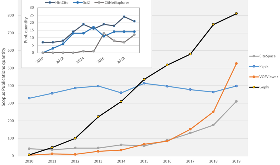
In Table 3, through the Scopus references results, we can see four leaders (bold): Pajek, Gephi, VOSviewer and Citepsace. HistCite and Sci2 Tool citations clearly stand out from this group. This made it necessary to visualise the results of the publications’ dynamics on two charts (Figure 1). The number of records for VOSviewer has increased exponentially in the last five years. The same observations can be attributed to CiteSpace. However, Gephi, which gathered a large community of users since 2010, has constant and most significant growth of articles where Pajek’s usage is referenced, characterised by stable dynamics with no greater changes, which confirms that this traditional software has its own user groups.
It is worth noting that programs originate in, or maintain ties with different countries: Pajek (Slovenia); CiteSpace (USA, China); HistCite and Sci2 Tool (USA); VOSviewer and CitNetExplorer (Netherlands); and Gephi (France). The publications from the country of the developer(s) were analysed specifically to determine whether the software remained local or reached the global community of researchers. The top records showed that more than 10% of the publications were authored by scholars connected with China and the US: they mentioned CiteSpace (84% and 9%), VOSviewer (24% and 12%), Gephi (13% and 13%), Pajek (23% and 17%) and HistCite (36% and 28%). The Sci2 Tool was not used by Chinese researchers who authored the publications in this sample; bibliographic data led to the US, Germany, Netherland and England (47%, 24% 12% and 11%, respectively). Other countries featuring prominently in the metadata were Spain (VOSviewer, Pajek); Brazil and India (Gephi, Pajek); Slovenia (Pajek); and Russia (HistCite).
We also investigated the dissemination of knowledge regarding the programs, taking into account the source of information. Usually, software developers first publish papers reporting on the new product. Accordingly, we strived to find whether the most cited work related to a given software application was published by one of the designers. The results of this investigation, which was based on the data from the Web of Science database, are shown in Table 4. We can see that the developers were often responsible for the popularity of their software. However, in the case of Pajek, Leydesdorff (2006), as well as Batagejl and Mrvar (2002), promoted the application.
| Application | Cited paper | Citations count | Ratio to Total, % |
|---|---|---|---|
| Pajek | 1) Batagejl, V., and Mrvar, A. (2002). 2) Leydesdorff, L., and Vaughan, L. (2006) | 135 261 | 10 12 |
| CiteSpace | Chen, C. (2006). | 1527 | 27 |
| HistCite | 1) Garfield, E. (2004). 2) Garfield, E. (2009). | 169 177 | 17 15 |
| VOSviewer CitNetExplorer | van Eck, N.J., and Waltman, L. (2010). Van Eck, N.J., and Waltman, L. (2014) | 2596 190 | 42 67 |
| Sci2 Tool | Light, R.P., Polley, D.E., and Börner, K. (2014). | 30 | 24 |
| Gephi | Jacomy, M., Venturini, T., Heymann, S., and Bastian, M. (2014). | 902 | 41 |
The study also identified the disciplines or research areas where the science-mapping software was applied. This article follows the Web of Science’s classification of disciplines. The six disciplines were analysed where the use of the tools studied was most prominent. Thus, seven disciplines where the seven programs were most often used formed the basis for the matrix (Table 5). The percentage values indicate the ratio of publications related to a selected discipline to the total number of publications where a given tool was used.
| Information and Library science | Computer science | Environmental sciences Ecology | Engineering | Business economics | Social sciences other topics | Chemistry | |
|---|---|---|---|---|---|---|---|
| Pajek | 25% | 38% | 1% | 8% | 6% | 9% | 1% |
| CiteSpace | 11% | 24% | 17% | 16% | 14% | 16% | 1% |
| HistCite | 47% | 35% | 4% | 0% | 8% | 4% | 1% |
| VOSViewer | 18% | 16% | 12% | 10% | 16% | 5% | 0% |
| Sci2 Tool | 30% | 6% | 0% | 22% | 0% | 0% | 41% |
| Gephi | 10% | 31% | 1% | 12% | 7% | 13% | 1% |
| CitNetExplorer | 28% | 28% | 0% | 0% | 7% | 7% | 0% |
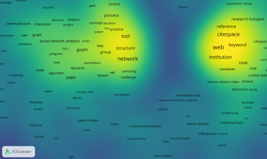
We can see (from the percentages in bold) that information science (library and information studies) and computer science dominated. Sci2 Tool is an exception, as it featured prominently in chemistry publications and quite strongly in engineering. It should be noted that social sciences include educational research. The sum query (based on logical OR) included all tools studied. The metadata (i.e., the titles, keywords, and abstracts) were analysed for co-words by setting a co-occurrence threshold (the minimal number of pairs of words taken into account), at 10. The final network shows two separate clusters (Figure 2). In the left cluster, we can find Pajek and Gephi, and in the right - CiteSpace, VOSViewer (and CitNetExplorer) and HistCite. The latter includes typical bibliometric software applications and needs that may be identified by terms and expressions occurring around the cluster (Figure 2 presents the most relevant part of the network). These are citation analysis, bibliography-based studies, and visualisations. The former cluster represented primarily researchers specialising in social network analyses, algorithms, and studies closer to computer sciences. The Sci2 Tool, which appeared in two forms (‘SCI’ and ‘SCI2’), was near to both clusters.
Availability of video tutorials
The analysis of video tutorials was limited to videos uploaded between 2010 and 2019; 339 videos fit the criteria. It was based on metadata such as title, year of uploading, view count and language. The data regarding the year of uploading allowed us to track the patterns of uploading videos focused on specific tools and analyse how they changed over time. Figure 3 shows the annual number of uploaded videos for every program studied. There were no tutorials concerning CitNetExplorer. Only data for Gephi is continuous; the rest comes in discrete segments.
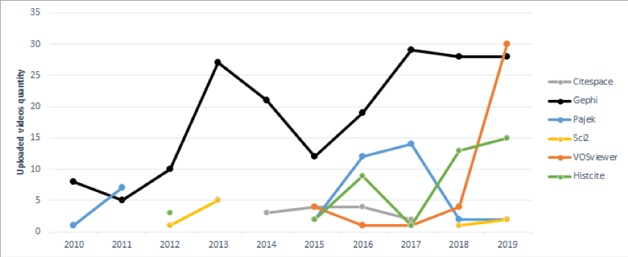
Figure 3: Dynamics of the yearly numbers of uploaded videos concerning the seven tools (2010–2019)
We can conclude that Gephi was popular enough that video tutorials were uploaded every year, while other programs remained unacknowledged for year-long periods. For example, no new video tutorials on Sci2 Tool were uploaded between 2012 and 2017. We can also see that the number of videos focused on VOSviewer had been rising rapidly from 2018 until the end of the decade. Overall, Gephi was the subject of a higher number of tutorials than the rest of the programs combined. The significant decrease in the numbers from 2013 to 2015 may raise some questions. According to the information on Gephi’s history available on Github (Levallois, 2017), the program was not updated between 2012 and 2015. The project had been developed chiefly by volunteers, who at the time were PhD students. It is likely that they devoted these three years to their academic careers.
| Language | 2010 | 2011 | 2012 | 2013 | 2014 | 2015 | 2016 | 2017 | 2018 | 2019 | TOTAL |
|---|---|---|---|---|---|---|---|---|---|---|---|
| TOTAL | 9 | 12 | 14 | 37 | 24 | 24 | 45 | 47 | 48 | 79 | 339 |
| English | 9 | 11 | 9 | 18 | 20 | 16 | 23 | 30 | 25 | 22 | 183 |
| Portuguese | 6 | 3 | 4 | 5 | 10 | 10 | 16 | 54 | |||
| Spanish | 1 | 6 | 1 | 3 | 1 | 2 | 8 | 23 | 45 | ||
| Chinese | 3 | 1 | 12 | 4 | 20 | ||||||
| German | 1 | 3 | 1 | 2 | 7 | ||||||
| French | 6 | 1 | 7 | ||||||||
| Arabic | 2 | 4 | 6 | ||||||||
| Indonesian | 5 | 5 | |||||||||
| Korean | 1 | 2 | 1 | 4 | |||||||
| Turkish | 2 | 1 | 3 | ||||||||
| Persian | 2 | 2 | |||||||||
| Hebrew | 1 | 1 | |||||||||
| Catalan | 1 | 1 | |||||||||
| Russian | 1 | 1 |
The next issue is the linguistic diversity of the uploaded video tutorials. Table 6 shows that English tutorials constitute the vast majority (183 of 339) of all videos studied. We can also analyse the changes in the numbers of videos uploaded over time according to language. Again, English tutorials seem to be a staple, the numbers consistently increasing.
However, by the end of the decade, the number of Portuguese and Spanish materials has increased. The sample also featured small numbers of videos in different languages (Persian, Turkish, Korean) and individual videos in others (Russian, Catalan, and Hebrew). It is worth noting that the language of the uploaded video constitutes information not only about the uploader, but also about their expectations regarding the audience.
The view counts of different videos were analysed to assess their popularity. Figure 4 shows the distribution of view counts per program The most popular tool (at the time when the data was collected) was Gephi (79%), the least popular, Sci2 Tool (with less than 1% of the views). Taking into account that Gephi tutorials were uploaded onto YouTube before any others, this is not surprising. The average yearly number of views of video tutorials devoted to Gephi is close to 150,000. Unfortunately, YouTube channels do not provide the data on the view count dynamics.
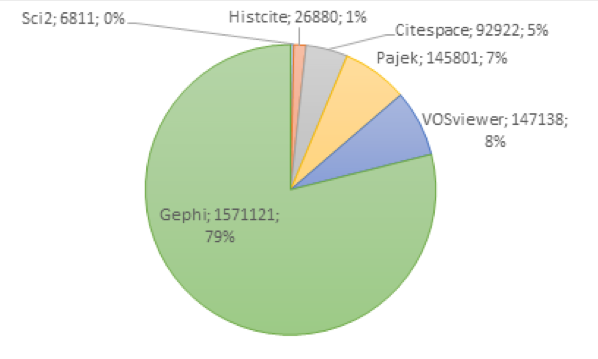
Figure 4: Total views of video tutorials per tool (2010–2019)
The names of YouTube videos can be as informative as the titles of academic articles. Because of the small number of items (339), text statistics were applied to the entire dataset, and the frequencies of title words were calculated. Table 7 presents the results of this analysis for the 10 most frequent terms. The most common phrases in the titles were the names of the tools, such as Gephi, Pajek, VOSviewer, HistCite, as well as words ‘tutorial’, ‘network’, ‘analysis’, ‘data’, ‘using’ and ‘how.
As far as text analysis is concerned, the network of material from short texts is presented, often used in science mapping (Leydesdorff and Nerghes, 2017). A network of title terms was constructed by means of co-word analysis, and measured. The betweenness centrality, which measures centrality based on the shortest paths in a graph, shows which nodes are the most pivotal for information flow in a network (Barabási, 2016). The four most essential words in our network are Gephi (0.874), VOSViewer (0.124), Pajek (0.070) and CiteSpace (0.054). High values of Gephi and VOSViewer indicate that they featured most often in the names of video tutorials. They were located inside the network of terms and were the most influential for the overall information flow.
| Term | Frequency | % |
|---|---|---|
| Gephi | 179 | 7.99% |
| tutorial | 49 | 2.19% |
| network | 38 | 1.70% |
| HistCite | 31 | 1,38% |
| Pajek | 31 | 1.38% |
| VOSviewer | 29 | 1.30% |
| Data | 23 | 1.03% |
| analysis | 22 | 0.98% |
| Using | 21 | 0.94% |
| How | 20 | 0.89% |
Online visibility of the science mapping software
As commercial products, science mapping software needs to be promoted. It has become a standard of online promotion to advertise the product on social media and to encourage public discussion. Social media activity can be considered in terms of altmetrics, i.e. as a measure of the users’ interest in scientific research and tools. For the purposes of the comparison, we identified four primary activities that will allow us to assess the tool’s online visibility, which may reflect its popularity. These activities are:
- Official Facebook posts
- Official Twitter posts
- All Instagram posts with hashtags
- An official webpage, if available
Only two tools had official fanpages on Facebook - Gephi and CiteSpace. The social activity in terms of publishing posts was different for each. Since 2010, the Gephi fanpage has published only twelve posts, with the last one in 2014. On the other hand, the CiteSpace fanpage has published tens of posts yearly since 2011, coming to a total of 203 posts.
The activity on Twitter followed similar patterns. The only programs with their own accounts were Gephi and CiteSpace, but the activity there was significantly higher. Gephi had sent 1673 tweets since 2009 and CiteSpace had sent 470 tweets since 2010. It is worth noting that tweets were sent regularly. The other tools did not have dedicated Twitter accounts. The site did not make available information regarding the number of posts with a specific hashtag. Future research, using paid tools such as TweetBinder, may examine the date of this type.
There were no official accounts on Instagram, but the website makes statistics available to all users. Table 8 shows the number of posts featuring a hashtag with the name of the tool, such as #histcite or #sci2, as of June 2020. CitNetExplorer, as the newest application, had no mentions on Instagram.
| Application | Facebook posts | Twitter posts | Instagram hashtag posts |
|---|---|---|---|
| CiteSpace | 32 | 470 | 30 (#citespace) |
| Gephi | 203 | 1673 | 504 (#gephi) |
| Pajek | 0 | 0 | 1015 (#pajek) |
| HistCite | 0 | 0 | 2 (#histcite) |
| Sci2 Tool | 0 | 0 | 256 (#sci2) |
| VOSViewer | 0 | 0 | 39 (#vosviewer) |
Unfortunately, browsing the results showed that not all the posts were relevant to our study: for example, posts with the hashtag #pajek also contained images of spiders (the word pajek means 'spider' in Slovenian), so the data would have to be verified (manually or automatically) to eliminate such irrelevant posts.
The availability of the tools’ official websites was discussed above in relation to Table 1. Most of these are specialised pages with full descriptions, a download section and links to manuals. The only tool without a website was HistCite, but a link to download the previous version was available on the Software Informer Website, while the Clarivate site informs that it is no longer officially supported.
Summary and discussion
The development of science mapping tools is discussed with increasing frequency in biblio- and scientometric scholarship. Global bibliographic databases allow scholars to compare different tools. From 2013 onwards, the numbers of both publications and citations related to this specialised software have increased (He, et al., 2019; Lou, et al., 2020). A kinescope-like area chart, used in this study, clearly shows how these numbers changed.
The authors selected seven tools intended for scholars. The tools were compared in terms of bibliometrics, altmetrics, and online presence. In the first part (Figure 1), a significant increase can be seen in the number of articles concerning two of the programs: VOSviewer and CiteSpace, as well as moderate growth for Gephi and Pajek. The remaining programs, Sci2 Tool and HistCite, were used by a smaller number of authors. We cannot definitively characterise the usage of the more recent CitNetExplorer.
The altmetric analysis of users’ online activity took account of the alternative scientometric material. It encompassed tutorials concerning the tools discussed, as well as their digital footprint on social media: Facebook, Twitter, Instagram. We can formulate several observations regarding the tutorials:
- Only Gephi tutorials were uploaded constantly, with an uptrend (Figure 3). Gephi material also has the highest view count, which constitutes 80% of the total view count for all tools programs (Figure 4).
- Video tutorials were available in fourteen languages (Table 6). English tutorials dominated, which is typical for YouTube and other media communication.
- Tutorial titles usually include the name of the tool (Table 7). This is appropriate because according to text and network analyses, titles indicate high representativity and recognition, which will be useful for information retrieval.
- The tools’ presence on social media was assessed according to the number of posts on Facebook, Twitter and hashtags on Instagram, as well as the availability of official websites (Table 8).
- Only Gephi and CiteSpace have been visible on Facebook and Twitter since 2010. Only these two and Pajek are visible on Instagram.
- All programs excluding HistCite (created by Garfield) have an official Website.
The results of bibliometric and altmetric analyses may show whether the popularity of the programs among the researchers, reflected by the mentions in publications, corresponds with the popularity of related tutorials. The number of papers did not increase after the tutorials were uploaded. This means that they might have no direct impact on the researchers’ decisions regarding the selection of their tools. However, in the case of VOSviewer, the rapid increase in the number of tutorials uploaded might be a result of the increased number of publications (for the years 2017–2019).
The online presence had no discernible effect on the popularity as reflected by publications. For example, VOSviewer featured in a high number of publications despite the lack of an official social media presence. A webpage might have promoted the tool among the broader audience, but the academics’ decisions are influenced by different factors. However, it is worth noting that:
- The protruding, constant growth of the number of publications featuring Gephi could be a result of a Twitter promotion campaign and a high number of video tutorials (and their high view counts), even if these factors contribute to its popularity.
- CiteSpace was promoted regularly on all social media, and its popularity is growing, despite the small number of video tutorials and the lack of an accessible manual. It featured in more publications than Gephi, but in fewer video tutorials.
- Despite its numerous unique features, Sci2 Tool was not promoted on social media or by video tutorials, and was rarely mentioned in publications. Perhaps the program is less popular because of a complicated user interface or an overwhelming selection of functions.
- Pajek, after more than twenty years of development, still inspires new video tutorials, and features in a steady level of publication count.
- HistCite was not so popular in the publications and did not have a website or social media presence, but a small community still uploaded video tutorials, possibly because of the availability of an extensive built-in manual.
The most cited papers concerned with the tools studied were written by the developers, which shows that they effectively disseminated information regarding their products in the scientific community. The range and dissemination of learning materials depend on both the authors’ and the users’ activity on YouTube and other social media. In theory, preparing tutorials and strong social media-driven communication with users show that the developer is involved in developing and creating a public image, which the users will appreciate. However, the results of the study showed that scholars for whom the programs are intended have different needs.
The analysed tools represent different generations of software, with different user interfaces, features, and purposes, but they are all related to bibliographic data analysis and visualisation. The co-word analysis of bibliographic data of publications featuring the programs showed that they are used for two primary purposes: typical bibliometric analysis (VOSviewer, CiteSpace and CitNetExplorer, HistCite) and a turn towards social network analysis (Gephi, Pajek, Sci2 Tool). The results also revealed that both CiteSpace and VOSviewer are used outside library and information science.
All programs (excluding Sci2 Tool) featured internationally, although the publication authorship was dominated by Chinese and US researchers. We can observe the growth of the scientific community writing in English, Spanish, and Portuguese. However, we could not identify any specific country from these data; these languages could be used as a first or second language in multiple countries. English dominates the video tutorial space, where fourteen languages in total were present.
Conclusions
The primary aim of this article was to compare the presence of seven visual scientometric tools in scholarship and on social media, taking into account their digital footprint and the relevant video tutorials.
We have found that the relationship between the tool’s online presence (including the accessibility of video tutorials), and the usage, measured by bibliometrics, was minimal. Thus, the authors’ hypothesis that online visibility affects the tool’s popularity with scholars was proved only partially true. There must be other factors determining the popularity of science mapping software in the scientific community.
To compare the programs, the authors combined four methods: 1) literature review, i.e. bibliometrics, 2) an analysis of video tutorials accessibility and their usage, i.e. tutmetrics; 3) an analysis of social media and Internet promotion/visibility, i.e. altmetrics, 4) a comparison of features. The data were plotted and visualised. It is worth noting that the authors proposed a term for this purpose and used it in previous research: tutmetrics (Osinska and Klimas, 2021). This concept may contribute to the study of the users of science mapping software, and their information needs. The results of such an analysis can be especially useful to software creators, who might consider them as guidelines for further projects.
Analysing the video tutorials space (N=339) identified fourteen languages, dominated by English. Various languages of the video tutorials reflected the geospatial evolution of the community using scientific software. It seems that there is a need for a more in-depth study of the educational materials available online and their impact on the scholars’ selection of tools.
Software developers can popularise their products by publishing in global databases. Bibliometric analysis demonstrated that this strategy is effective, as the developers’ publications had the most citations. However, some tools were used in scientific papers despite the lack of promotion. This means that there are factors not considered in current research, which have a significant impact on the selection between the tools. Nevertheless, research combining bibliometric study with other methods originating in web data, and scholars’ communication and behaviour on specialised networking services, should be continued and developed.
Future research will focus on further assessments of programs intended for scholars, their features as well as their usability, and availability of workshops. The authors also plan to analyse discussions of the mentioned software conducted on social networking sites. The development of a program for scientists is a complex and difficult process, but it can be successful if the developers pay proper attention and prepare well.
About the authors
Veslava Osinska is an Associate Professor at the Institute of Information and Communication Research of Nicolaus Copernicus University in Torun, Poland. Her research interest is in science visualisation. She is a memeber of ISKO, Polish chapter.
Radoslaw Klimas is a PhD student of the Doctoral School Academia Rerum Socialium at Nicolaus Copernicus University in Torun. He is interested in science mapping.
References
Note: A link from the title is to an open access document. A link from the DOI is to the publisher's page for the document.
- Allgood, E. F. H., Garfield, E., Börner, K., Witkowski, J., & Pollock, L. (2007). II.5 HistCite™ visualization of DNA development. Places & Spaces. http://scimaps.org/mapdetail/histcite_visualizati_52. (Archived by the Internet Archive at https://bit.ly/3jW69eZ)
- Bankar, R., & Lihitkar, S. (2019). Science mapping and visualization tools used for bibliometric and scientometric studies: a comparative study. Journal of Advancements in Library Sciences, 6(1), 382-394. https://doi.org/10.37591/joals.v6i1.1807
- Barabási, A. B. (2016). Network science. Cambridge University Press.
- Bastian, M., Heymann, S., & Jacomy, M. (2009). Gephi: an open source software for exploring and manipulating networks. In Proceedings of the Third International AAAI Conference on Weblogs and Social Media, San Jose, California, May 17 – 20, 2009. (pp. 361-362). AAAI Publications. https://doi.org/10.13140/2.1.1341.1520
- Batagejl, V. & Mrvar, A. (2002). Pajek— analysis and visualization of large networks. In P. Mutzel, M. Jünger, & S. Leipert (Eds.) Graph drawing. 9th International Symposium, GD 2001 Vienna, Austria, September 23–26, 2001 (pp. 477-478). Springer. (Lecture Notes in Computer Science, vol. 2265) https://doi.org/10.1007/3-540-45848-4_54
- Börner, K. (2010). Atlas of science. MIT Press.
- Börner, K., Chen, C., & Boyack, K. (2003). Visualizing knowledge domains. Annual Review of Information Science and Technology, 37(1), 179-255. https://doi.org/10.1002/aris.1440370106
- Börner, K., Huang, W., Linnemeier, M., Duhon, R., Phillips, P., Ma, N., & Price, M. (2010). Rete-netzwerk-red: analysing and visualizing scholarly networks using the network workbench tool. Scientometrics, 83(3), 863-876. https://doi.org/10.1007/s11192-009-0149-0
- Chen, C. (2004). Information visualization. Springer-Verlag.
- Chen, C. (2006). CiteSpace II: Detecting and visualizing emerging trends and transient patterns in scientific literature. Journal of the American Society for Information Science & Technology, 57(3), 359-377. https://doi.org/10.1002/asi.20317.
- Chen, C. (2017a). Representing scientific knowledge: the role of uncertainty. Springer International Publishing.
- Chen, C. (2017b). Science mapping: a systematic review of the literature. Journal of Data and Information Science, 2(2), 1-40. https://doi.org/10.1515/jdis-2017-0006
- Cobo, M. J., López-Herrera, A. G., Herrera-Viedma, E., & Herrera, F. (2011). Science mapping software tools: review, analysis, and cooperative study among tools. Journal of the American Society for Information Science and Technology, 627), 1382-1402. https://doi.org/10.1002/asi.21525
- Garfield, E. (1955). Citation indexes for science: a new dimension in documentation through association of ideas. Science, 122(3159), 108-111. https://doi.org/10.1126/science.122.3159.108
- Garfield, E. (1994). Scientography. Mapping the tracks of science. Current Contents: Social & Behavioural Sciences, 7(45), 5-10.
- Garfield, E. (2004). Historiographic mapping of knowledge domains literature. Journal of Information Science, 30(2), 119-145. https://doi.org/10.1177/0165551504042802.
- Garfield, E. (2009). From the science of science to scientometrics visualizing the history of science with HistCite software. Journal of Informetrics, 3(3), 173-179. https://doi.org/10.1016/j.joi.2009.03.009
- Garfield, E., Sher, I. H., & Torpie, R. J. (1964). The use of citation data in writing the history of science. Institute for Scientific Information, Inc.
- He, J., Lou, W., & Li, K. (2019). How were science mapping tools applied? The application of science mapping tools in LIS and non-LIS domains. Proceedings of the Association for Information Science & Technology, 56(1), 404-408. https://doi.org/10.1002/pra2.38
- Jacomy, M., Venturini, T., Heymann, S., & Bastian, M. (2014). ForceAtlas2, a continuous graph layout algorithm for handy network visualisation designed for the Gephi software. PLOS One, 9(6), e98679. https://doi.org/10.1371/journal.pone.0098679.
- Levallois, C. (2017). History of Gephi. https://bit.ly/3oLpxhL. (Archived by Internet Archive at https://bit.ly/3iRg5XW)
- Levin, N., Leonelli, S., Weckowska, D., Castle, D., & Dupré, J. (2016). How do scientists define openness? Exploring the relationship between open science policies and research practice. Bulletin of Science, Technology & Society, 36(2), 128–141. http://dx.doi.org/10.1177/0270467616668760
- Leydesdorff, L. (2010). Eugene Garfield and algorithmic historiography: co-words, co-authors, and journal names. http://www.leydesdorff.net/garfield_historiography/ (Archived by the Internet Archive at https://bit.ly/3fkmu9s)
- Leydesdorff, L., & Nerghes, A. (2017). Co‐word maps and topic modeling: a comparison using small and medium‐sized corpora (N < 1,000). Journal of the American Society for Information Science and Technology, 68(4), 1024-1035. https://doi.org/10.1002/asi.23740
- Leydesdorff, L., & Vaughan, L. (2006). Co-occurrence matrices and their applications in information science: extending ACA to the Web environment. Journal of the American Society for Information Science & Technology, 57(12), 1616-1628. https://doi.org/10.1002/asi.20335. (https://arxiv.org/abs/0911.3422)
- Light, R.P., Polley, D.E., & Börner, K. (2014). Open data and open code for big science of science studies. Scientometrics, 101(2), 1535–1551. https://doi.org/10.1007/s11192-014-1238-2
- Lou, W., Zhang, J., Li, K., and He, J. (2020). Understanding the application of science mapping tools in LIS and non-LIS domains. Data and Information Management, 4(2), 94–108. https://doi.org/10.2478/dim-2020-0006
- Maricato, J. M., & Vilan-Filho, J. L. (2018). The potential for altmetrics to measure other types of impact in scientific production: academic and social impact dynamics in social media and networks. Information Research, 23(1), paper 780. http://InformationR.net/ir/23-1/paper780.html (Archived by WebCite® at http://www.webcitation.org/6xmqq4Nvh)
- Mcfedries, P. (2012). Measuring the impact of altmetrics [Technically Speaking]. IEEE Spectrum, 48(8), 28. https://doi.org/10.1109/MSPEC.2012.6247557
- Merkt, M., Weigand, S., Heier, A., & Schwan, S. (2011). Learning with videos vs. learning with print: the role of interactive features. Learning and Instruction, 21(6), 687-704. https://doi.org/10.1016/j.learninstruc.2011.03.004
- Mingers, J., & Leydesdorff, L. (2015). A review of theory and practice in scientometrics. European Journal of Operational Research, 246(1), 1-19. https://doi.org/10.1016/j.ejor.2015.04.002
- Munaro, A. C., Barcelos, R. H., Maffezzolli, E. C. F., Rodrigues, J. P. S., & Paraiso, E. C. (2020). The drivers of video popularity on youtube: an empirical investigation. In F. J. Martínez-López, & S. D'Alessandro (Eds.). Advances in Digital Marketing and eCommerce (pp.70-79). Springer. https://doi.org/10.1007/978-3-030-47595-6_10
- Muñoz-Muñoz, A. M., & Mirón-Valdivieso, M.D. (2017). Analysis of collaboration and co-citation networks between researchers studying 'violence involving women'. Information Research, 22(2), paper 758. Retrieved from http://informationr.net/ir/22-2/paper758.html (Archived by WebCite® at http://www.webcitation.org/6r5U5gOsZ)
- Osinska, V., & Bala, P. (2015). Study of dynamics of structured knowledge. Qualitative analysis of different mapping approaches. Journal of Information Science, 41(2), 197-208. https://doi.org/10.1177/0165551514559897
- Osinska, V., & Klimas, R. (2021). Tutmetrics and usability: the footprint of science mapping tools in tutorial space. In W. Glänzel, S. Heeffer, P-S. Chi, & R. Rousseau, (Eds.). Proceedings of the 18th International Conference On Scientometrics & Informetrics, KU Leuven, Belgium, July 12-15, 2021. pp. 1493-1494. International Society for Scientometrics and Informetrics.
- Osinska, V., & Malak, P. (2014). Maps and Mapping in Scientometrics. In M. Góralska & A. Wandel (Eds.). Methods and tools for digital writing and users study (pp. 59-73). Wydawnictwo Uniwersytetu Wrocławskiego.
- Pradhan, P. (2017). Science mapping and visualization tools used in bibliometric & scientometric studies: an overview. INFLIBNET Newsletter, 23(4), 19-33. https://ir.inflibnet.ac.in/bitstream/1944/2132/1/INFLIBNET NEWSLETTER Vol.23 No. 4 (October- December 2016).pdf
- Pranckutė, R. (2021) Web of Science (WoS) and Scopus: the Titans of bibliographic information in today’s academic world. Publications, 9(1). https://www.mdpi.com/2304-6775/9/1/12/pdf. https://doi.org/10.3390/publications9010012
- Priem, J., Taraborelli, D., Groth, P., & Neylon, C. (2011). Altmetrics: a manifesto. http://altmetrics.org/manifesto/ (Archived by the Internet Archive at https://bit.ly/2PaEWaa)
- Ryan, F. V. C., Hall, H., Cruickshank, P., & Lawson, A. (2019). Build, manage and evaluate; information practices and personal reputations on social media platforms. Information Research, 24(4), paper 1935. http://InformationR.net/ir/24-4/colis/colis1935.html (Archived by the Internet Archive at https://bit.ly/30ijrdZ)
- Ryan, F. V. C., Cruickshank, P., Hall, H., & Lawson, A. (2016). Managing and evaluating personal reputations on the basis of information shared on social media: a Generation X perspective. Information Research, 21(4), paper isic1612. http://www.informationr.net/ir/21-4/isic/isic1612 (Archived by the Internet Archive at http://bit.ly/2KWk7wF)
- Smiraglia, R. (2015). Domain analysis of domain analysis for knowledge organization: observations on an emergent methodological cluster. Knowledge Organization, 42(8), 602-611. https://doi.org/10.5771/0943-7444-2015-8-602
- van Eck, N. J., & Waltman, L. (2010). Software survey: VOSviewer, a computer program for bibliometric mapping. Scientometrics, 84(2), 523-538. http://doi.org/10.1007/s11192-009-0146-3.
- van Eck, N. J., & Waltman, L. (2014). CitNetExplorer: a new software tool for analysing and visualizing citation networks. Journal of Informetrics, 8(4), 802-823. https://doi.org/10.1016/j.joi.2014.07.006
- van Eck, N. J., Waltman, L., Dekker, R., & Van den Berg, J. (2010). A comparison of two techniques for bibliometric mapping: multidimensional scaling and VOS. Journal of the American Society for Information Science and Technology, 61(12), 2405-2416. https://doi.org/10.1002/asi.21421.
- Wagner, A. B. (2015). A practical comparison of Scopus and Web of Science. [PowerPoint slides]. In Proceedings of Upstate New York Science Librarians Conference. https://surface.syr.edu/nyscilib/70 (Archived by the Internet Archive at https://bit.ly/3kW6znJ)
- White, H. D, Lin, X., & McCain, K. W. (1998). Two modes of automated domain analysis: multidimensional scaling vs Kohonen feature mapping of information science authors. In M. Haidi, J. Maniez, & S.A. Polit (Eds.). Proceedings of the Fifth International ISKO Conference 1998, Lille, France, August 25-29, 1998. (pp. 57–61). Ergon Verlag.
- Wouters, P., Thelwall, M., Kousha, K., Waltman, L., de Rijcke, S., Rushforth, A., & Franssen, T. (2015). The metric tide: literature review. Supplementary report I to the Independent Review of the Role of Metrics in Research Assessment and Management. Higher Education Funding Council for England. https://doi.org/10.13140/RG.2.1.5066.3520
- Zhou, L. X., & Tang, T. Y. (2015). The The negative effects of 'too accurate' recommendation results: a pilot study of the effects of search engine overuse on Chinese students. In Y. Chen, W-T. Balke, J. Xu, W. Xu, P. Jin, X. Lin, T. Tang, & E. Hwang, (Eds.) WAIM: International Conference on Web-Age Information Management, Macau, China, June 16-18, 2014. (pp.299-306). Springer. (Lecture Notes in Computer Science, 8597). https://doi.org/10.1007/978-3-319-11538-2_27.