Information Research, Vol. 4 No. 3, February 1999


Information Research, Vol. 4 No. 3, February 1999 | ||||
 |
 |
|||
This paper concerns the development and use of a graphical methodology in the analysis of individuals World Wide Web navigational behaviour. Specifically, it reports on the comparison of this methodology to other methodologies of qualitative analysis. Examples are given of the graphical representations of individuals interactions with particular World Wide Web medical resources, and the integration of these graphical representations with textual data considered. Indications for further development in this area are also suggested.
The growth of the World Wide Web (WWW, Web) in recent years has led to its becoming an important information resource for any number of academic subject domains. Of these, medicine finds itself particularly well represented, and a large number of Web resources are now available for nurses, doctors and researchers at both student and practitioner levels. Given the size and variety of such sites, however, the effectiveness with which medical students and practitioners at all levels can use different resources may vary. The need for careful observation and analysis of actual user behaviour in these circumstances is summarised by Raya Fidels (1991) comment that understanding user behavior is essential to the design of advanced, user-orientated systems. As a consequence, my study has sought to model actual user responses and stated needs to medical Web resources displaying a variety of information-retrieval characteristics.
Specifically, this study has sought to:
- all within a discrete subject domain. An alternative way to phrase these objectives would be to ask the questions: why do Web resources display a variety of information-retrieval characteristics? Or, alternatively: what effect does the availability of these different information-retrieval characteristics have on the behaviour of users?
This paper will I hope go some way to explain the methodology by which I have attempted to answer these questions, and as such is an extension and up-dating of a paper given at the 5th International ISKO Conference, at Lille1.
Thirty volunteers were drawn from several fields of nursing and medicine at undergraduate, postgraduate, researcher and practitioner levels here at the University of Sheffield. Figure 1 shows the break-down of these 30 into the various groups represented:
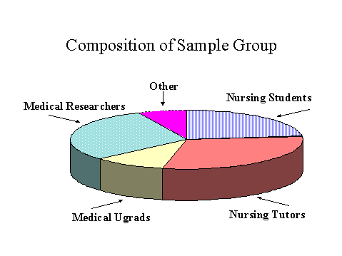
Figure 1: Composition of Sample Group
Each volunteer was qualitatively interviewed to establish the context of their habitual information-seeking behaviour. Data concerning their history of Web use was also collected, and Ridings cognitive styles test was administered and its results recorded. Volunteers were then asked to perform a search on two medical World Wide Web resources, each of which offered both search-based and directory-based opportunities for accessing information. During the searching exercise, a Think Aloud Protocol was created, and observational data collected. Finally, a last qualitative interview collected the volunteers thoughts about the exercise he or she had just undertaken.
The qualitative data collected from these interviews and Think Aloud Protocols has been analysed using Glaser and Strauss Grounded Theory. The observational data collected during the searching exercise was then used as the basis for a graphical representations of each volunteers unique interactions with each system. By using a graphical methodology to display each volunteers navigational behaviour, it was then possible to collect more qualitative and quantitative data from the diagrams themselves, in line with Tuftes (1983) statement that graphics reveal data.
Before considering one of the completed diagrams, it is worth pausing for a moment to explain the choice of the symbols used, and which are displayed in Figure 2.

Figure 2: Symbols Used
The first important point to make concerns the visibility of the highly distinct Navigational Option and Input Search Terms symbols. These provide an instant indication of the information retrieval mechanism selected by the user at different periods of the interaction: either using his or her own query terms, or using existing navigational options provided by the system: and these would be for instance, Return to Search Screen,or Next Records. Similar navigational behaviour is displayed in the use of the grey Browser Functions symbol, which allows for the use of Back, Forward or Stop at Browser level to be indicated. At the next stage of the interaction, the results of the navigational choices made by the user are discernible in the Output, Web Site and Document symbols. These help to isolate the system reaction to the search terms or navigational options chosen by the user. The user reaction to this output may be clearly seen by the progress of the interaction, as indicated in strict sequence by the arrow, or Sequence Indicator. Further indication of the approval with which the user perceived documents or sites during the search is provided by the tick Useful. Lastly, and for thoroughness, the Other Action Required symbol allows unusual or unexpected actions taken by the user to be represented in their correct moment in the interaction.
Figure 3 shows the graphical representation of the interaction of volunteer MA04 and the Internet Grateful Med system2, found at the US National Library of Medicines website.
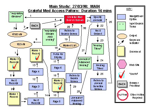
Figure 3
MA04s choice of information-retrieval mechanism available at different stages of his search, and at different locations within the site, is clear: green, Input Search Terms boxes show the use of the volunteers own query terms, and blue, Navigational Option rectangles can also be clearly seen. The process whereby each of these mechanisms has been employed at different stages of the search, and in response to a variety of search outcomes is also highly visible by use of the Sequence Indicators. Thus, the use of this methodology of graphically representing user navigational behaviour presents the researcher with a number of useful and immediate insights into the choices of information retrieval mechanism used by the volunteer during the interaction. Analysis of the graphical representation of each interaction therefore allows detailed data concerning their use, re-use or abandonment of specific methods of interaction with each system to be seen. The provision of this holistic and visual overview of all actions and responses made during the interaction, in their correct sequence, gives the researcher the ability to obtain secondary and useful impressions from the consideration of the navigational options selected and the pattern of navigational process displayed both for each individual interaction and comparatively between interactions.
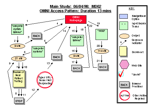
Figure 4
By contrast, Figure 5 shows that MB01 took 16 actions and almost exclusively used existing navigational options.
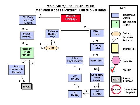
Figure 5
Lastly, Figure 6 shows that MA01 can be seen to have used a massive 51 actions in 13 minutes, and used both her own query terms and navigational options, as well as very extensive use of the browser function Back.
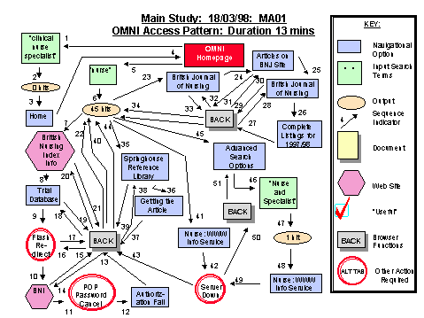
Figure 6
But what influence can such diagrams have on the analysis of the data? These diagrams, apart from being a convenient way in which to represent the navigational actions of each volunteer, also assist the researcher in understanding and collecting data of other kinds. Principally, there are three areas in which this process may occur:
I will now go on to look at the first two of these points in depth, and consider important indications for future research with the last point.
During the conduct of this study, several elements of interest have arisen concerning the use of the differing navigational options and their effects on system response, search outcome and the user. Preliminary indications of such elements of interest can be provided by the diagrams, and these can then be followed in the qualitative data.
To consider Figure 3 once again, MA04s interaction may be described as one where a relatively high number of actions were taken for a relatively small number of useful hits: he makes 4 separate inputs, works with a set of 102, takes 29 actions and marks just 7 records as useful. This impression, drawn from the diagram, may then be compared with the qualitative data. Here, the volunteer was asked for his impressions of this resource, and while he approved of the layout and appearance of the site, he expressed dissatisfaction with the outcome of this interaction, saying:
it was difficult to use though, because it didnt actually get what I wanted from it, which whats the point? As an information source it sort of misses the point really.A statement which may be seen to have a lot in common with the interaction this volunteer had just completed: one of high efforts for low returns, spread out over 16 minutes.
From the same diagram, it is possible to extract new quantitative data, which can then be compared to that collected from other diagrams for instance, representing the same volunteer searching an alternative system:
|
|
Grateful Med |
MedWeb [3] |
| No. Actions |
29 |
47 |
| Duration |
16 |
45 |
| No. Inputs |
4 |
6 |
| No. Navigational Movements |
14 |
19 |
| Total Hits |
6892 |
0 |
| Browser Functions Used |
1: BACK |
5: BACK |
Figure 7
Figure 7 shows the comparative quantitative data drawn from two such diagrams: these are the diagrams representing the same volunteers interactions with two different systems. As you can see, while almost the same number of actions were taken over a similar length of time, the volunteer in this interaction got absolutely no hits, and made much more extensive use of the browser functions to navigate within the site.
Again, a comparison with the qualitative data is also informative. When asked for his impressions about MedWeb, the volunteer expressed his annoyance at the coverage of the resource, which unlike Internet Grateful Med, does not hold document surrogates but links to institutional WebPages: something he found confusing, and which therefore reduced the effectiveness of his search:
Again, extremely irritating because it doesnt actually tell you that when youre searching for things that youre searching for institutions, it took a long time to work that one out, and thats a bit irritating,
So again, the diagrams may provide useful quantitative data, and this may in turn lead to a re-examination of the qualitative data already collected.
But there may be a third way in which these diagrams can prove useful, and that, as suggested earlier, is in the potential comparisons between such representations of navigational behaviour and the data relating to an individuals field independence, or specifically, comparisons between the graphical representations of interactions made by volunteers exhibiting particular scores on Ridings Cognitive Styles Analysis. In this study, Ridings test has been mainly used to collect field independence data, as this data was considered potentially relevant to the question of why different users prefer or avoid systems with different information-retrieval characteristics.
Riding places individuals in any one of nine positions, relative to their scores on the Wholist-Analyst scale, and Verbal-Imager scale. While the number of volunteers used in this study is really too small for any valid comparison of cognitive style data at the statistical level, it may yet be possible to contrast the navigation patterns and choices of navigation options between subjects displaying different cognitive styles. It is hoped that, in the near future, a comparison may be able to be made of the diagrams of navigational behaviour from one individual with those of others who also share the same cognitive style. Again, the numbers involved in this study may mean that no valid comparisons can be made, but it will be interesting to see whether any overall patterns emerge, concerning, for instance, bias towards one type of interaction all within the framework of the particular Web resources used.
The use of these visual representations of the patterns of navigation within specific user-system interactions is one that may offer to the researcher particular benefits of clarity, low memory-load and indications of important areas of data. Work is continuing to develop and further research this methodology, and apply it to the data collected during this study, specifically in the areas of comparison between individuals, and between the behaviours of the same individual on different systems. . It is hoped that other researchers also undertaking qualitative research, and where representation of individuals navigation of Web resources is important, may also find this methodology one worth applying, and may also seek to develop it to meet their own requirements.
1. Lucas, H. (1998) "Representing WWW Navigational Data: A Graphical Methodology to Support Qualitative Analysis", In: El Hadi, Widad Mustafa, Maniez, Jacques & Pollitt, Steven A. (editors), Structures and Relations in Knowledge Organization. Proceedings of the 5th International ISKO Conference. Wurzburg: Ergon-Verlag. 402-408.
2. This site may be found via the page:http://www.nlm.nih.gov
3. This site may be found at: http://www.gen.emory.edu/MEDWEB/
How to cite this paper:
Lucas, Honey (1999) "Representing WWW navigational data: a graphical methodology to support qualitative analysis." Information Research, 4(3) Available at: http://informationr.net/ir/4-3/paper59.html
© the author, 1999. Last updated: 8th February 1999
Contents |
Home |